Storytelling is a powerful communication tool, and data is essential for many decision-making tasks. Together, they can be data visualization at its best: the science and art of transforming your data so that the most important points shine through. Sometimes a basic chart will do the trick. But to make your visual message really pop, it's often handy to add data and text to your chart. The rich data label capabilities in Excel 2013 give you tools to create visuals that tell the story behind the data with maximum impact.
Storytelling is a powerful communication tool, and data is essential for many decision-making tasks. Together, they can be data visualization at its best: the science and art of transforming your data so that the most important points shine through. Sometimes a basic chart will do the trick. But to make your visual message really pop, it’s often handy to add data and text to your chart. The rich data label capabilities in Excel 2013 give you tools to create visuals that tell the story behind the data with maximum impact.
The basics of data labels
To illustrate some of the features and uses of data labels, let’s first look at simple chart.
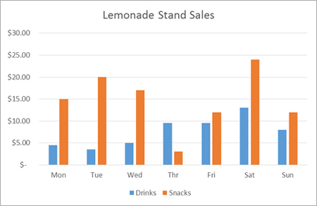
This clustered column chart shows the sales (revenue) of drinks and snacks from a neighborhood lemonade stand during one week. If I want to turn on basic data labels on the blue data series (Drinks), there are a few ways to do that. One familiar and simple way is just single click on any data value (or column, in this example) to select the entire data series that it belongs to.
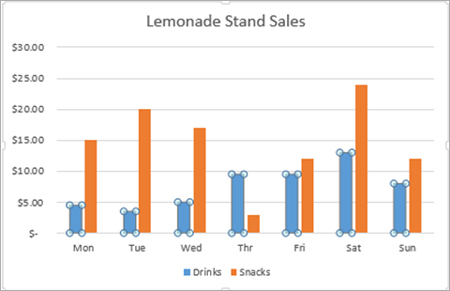
Above, I have clicked all of the blue columns. Once the series is selected, I can right-click any column to pull up the context menu, then click the Add Data Labels entry.
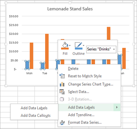
When I click Add Data Labels, I get the following result.
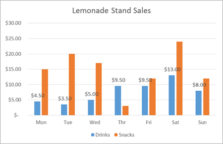
To reposition any single data label, all I have to do is double-click the data label I want to move, then drag it to the desired position on the chart. Here, I have selected only the Tue value of the blue Drinks series.

Once selected, I can drag that label wherever I want it on the chart. If I drag the label far from its default location, a leader line appears by default to show what data point the data label is associated with.
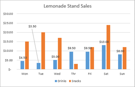
Basic formatting of data labels is simple to achieve by using the Font section of the Home tab on the Excel ribbon.

Use the Formatting Task pane for advanced options
If you wish to go beyond basic text formatting and text box fills, many more formatting options are available on the Formatting Task pane. Though there are several ways to open the Formatting Task pane, the easiest is to double-click the data labels themselves. Here, I have double-clicked one of the data labels for the blue Drinks series.
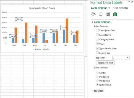
In the Formatting Task Pane, you can customize the way the data labels appear, change their size and alignment, change their text properties, and even add another data series for them to include.
Text in data labels
Often, the real story doesn’t lie in all the numbers in the chart, but it’s hidden in a few key data points. Let’s reapproach our example with that in mind.
First, I’ll delete the data labels that I already put in place. To delete all the data labels for a given series, click once on any data label in the series, and this will select them all. If you press the delete key on your keyboard, all the data labels from that series will disappear from your chart. To delete any single data label, follow the same procedure, except click twice (and not too fast) on the individual data label you wish to delete.
Below, I have inserted just one data label and moved it to a roomy place in the chart. Next, I want to type custom text into the data label box to help tell the story behind the data.
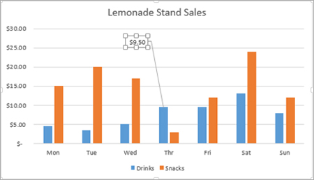
To make it easier to place an insertion point in the data label, I have found that it helps to zoom in on the chart. You can do this by adjusting the zoom control on the bottom right corner of Excel’s chrome.

Then, select the value in the data label and hit the right-arrow key on your keyboard.

The story behind the data in our example is that the temperature increased significantly on Wednesday and that appeared to help drive up business at the lemonade stand. So I type some text to emphasize that point while still leaving the data label intact.

Linked data embedded in data labels
Excel 2013 also lets you put numbers from your spreadsheet into your data labels – that is, numbers that are not directly associated with the data point. Here is a quick example. Let’s say that I want to add a further annotation about the temperature on Wednesday and I want to include a data value with that annotation. Here’s how I would do it:
First, I select my data label and I type some additional text to give context to the new number I’m about to add to the data label. Then, I right-click the data label to pull up the context menu. Note the Insert Data Label Field menu item.
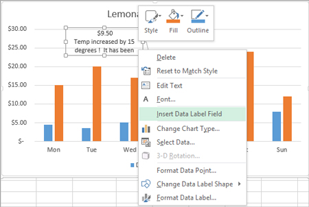
When I click Insert Data Label Field, Excel 2013 opens a dialog that gives me a few options to choose from. I want to pull in a data value that is calculated on my worksheet, so I select Choose Cell.

The Choose Cell option opens a familiar type of dialog that allows me to go back into my worksheet and select the cell with the value that will be shown in my data label. In this example, I select a cell that contains the value that shows how many days it has been since the temperature was this warm (26 days, in this case).

When I click OK, the value from the cell I selected (D39, here) appears in my data label. To finish it off, I type the rest of my statement and end up with a very rich data label.

Data label callouts
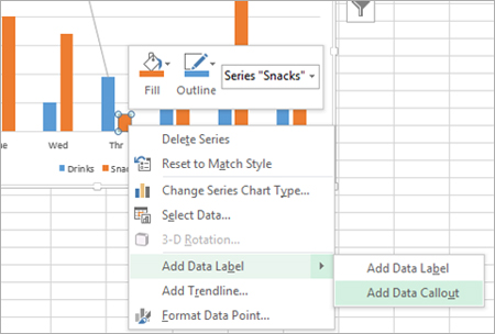
The data labels up to this point have used numbers and text for emphasis. Putting a data label into a shape can add another type of visual emphasis. To add a data label in a shape, select the data point of interest, then right-click it to pull up the context menu. Click Add Data Label, then click Add Data Callout. The result is that your data label will appear in a graphical callout. In this case, the category Thr for the particular data label is automatically added to the callout too.

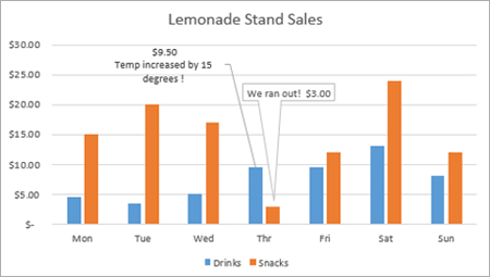
In the image below, I clicked inside the data callout, backspaced over the Thr entry, and then typed a bit of information that explains what is behind this anomalous data point.
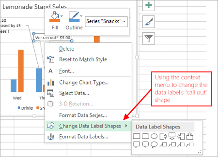
If you want to change the shape of a data callout, you can do so by right-clicking the data label to pull up the context menu, or by selecting the data label, then clicking Change Shape in the Format tab in the ribbon.
In this case, let’s say that for the Snacks value on Thursday, I don’t really want to show the value in the data label, but I’d like to make my point with something a bit more whimsical. For this, I turn to the rich formatting options in the Formatting Task pane we talked about earlier. Below, I have double-clicked the data label to pull up the Formatting Task pane for the data label.
Then, I clicked the Fill and Line symbol:
I then selected Picture or Texture Fill, and clicked on Online.

Let’s say that on Thursday the lemonade stand ran out of donuts, which were the main selling item in the snacks section. I can search Office Art on the web for an image of a donut to serve as the background in my data label.

I pick an image from the results, and it’s automatically inserted into the background of my data label.


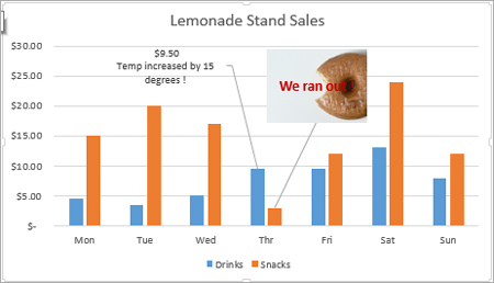
We’re almost there. The donut image is good, but it’s too small to convey the message. Also, I want to use a text comment instead of showing the data value for this point. So I re-size the data point’s bounding box, select the data value, and replace it with some clarifying text. I can adjust the text color and font size using the Font controls on the Home tab in the ribbon.
Tell us what you think
In this article, we used data labels with text, images, and shapes to help reveal the story behind the data. This example only scratches the surface of the many things you can do with data labels in Excel 2013. Have fun exploring and storytelling, and let us know in the comments how you’re putting data labels to work for you!

