Today’s blog post is brought to you by Cathy Harley a Program Manager on the Excel Chart team.
Have you ever wanted to add a horizontal or vertical line to your chart to indicate a key value, sales threshold, important date, or the average of your data? Are you looking to impress managers and convince clients with your superb charts? Reference Lines (see the dotted black line on the chart below) can be powerful tools in effectively communicating important points in your data. There is currently no specific built-in functionality for creating Reference Lines in Excel 2010, but there are still a few ways to add them to your chart.
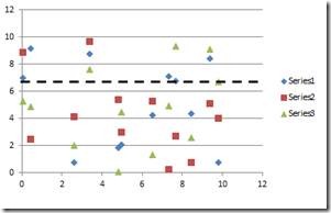
Here we’ll give you the steps to make these exciting visualizations—but we also want to hear uses you have for them, so tell us in a comment below!
Method 1: Simply Adding an AutoShape to Your Chart
If your line does not need to be exactly positioned, then the easiest method by far is to use a Shape to add a line to your chart. Simply click the Insert Tab on the Ribbon and select Shapes.
From here, click on the straight line and click and drag the object onto your chart in the location that you desire.
While this method is easy, it does have its downsides. Since the line is separate from your chart, every time you move or resize your chart you must also move or resize your line! Even without physically dragging your chart around alignment problems can arise. Say you add a reference line to a chart like this at 3.5, which is an important target for your data:
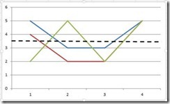
And then a value in your data changes, changing the value of the axis and leaving the line in a not-so right position for you to have to replace manually:
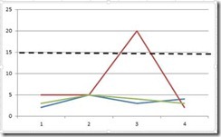
Never fear, a few extra steps in Method 2 and your line can stay in the perfect position!
Method 2: Creating an Additional Series
Perhaps you need to place your line in a very exact location on your chart. Have no fear—you can simply create an additional data series to plot your line
Let’s say you have a table like this:
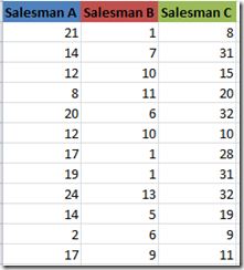
And you have a chart like this:
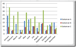
For a year-end review meeting, you’d like to be able to show how all of your salesmen did in comparison to the average target monthly sales goal. I.e., you want to end up with this:
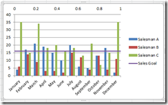
Never Fear! You can be here in a few simple steps.
First, create a new table on a blank portion of your grid that contains the value you want to plot (we’ll call this “Sales Goal” in our example, with a value of 16) and dummy x values of 0 and 1. The header that you use at the top of your second column, which we called “Sales Goal,” is the header that will appear next to your reference line in the chart legend. You also shouldn’t be concerned with constraining the data in your columns to a fixed value like we did—it can also be a formula! Your new table should look like this:

Make sure that if you use a formula in place of a fixed value that you use the same one for both rows.
Now, you’ll want to highlight these 6 cells in the table above and either right click or use a keyboard command to copy them. Then head on over to Select your entire chart so that it is surrounded by the silver band like this:
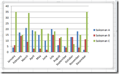
Next, you’ll want to look up to the Ribbon, and Select the menu from Paste under the Home tab.


Select Paste Special, and you’ll be brought to this new dialogue:
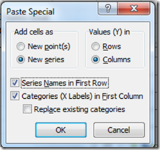
Make sure you select to Add the cells as New Series and check the boxes for both Series in First Row and Categories (X Labels) in First Column. The Values(Y) will be a default as the same style as your first series (Column, in this case).
You’ll now have two extra bars added to your chart. The next step is to right click the bars of the new series, the part of the chart shown selected below:
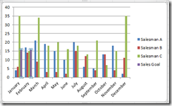
Right clicked the selected area, and choose the Change Chart Series Type option.
From here, select the X Y Scatter option with no data points:

Click ok, and your graph should look like this:
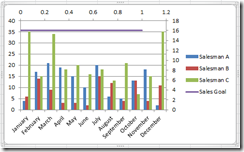
Clearly that purple line is not where we want it to be. Do not fear—we’re only a few steps away from bringing your Sales Goal line to its correct location in the chart.
Select the secondary X-axis (i.e., the one on the right hand side of the chart), and double click:
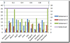
You’ll now get this box:
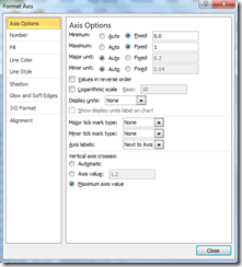
Set the Minimum to Fixed and 0 and the Maximum to Fixed and 1. Then make sure to select None as the menu option for both Major and Minor tick mark type.
Finally, select the secondary Y axis:
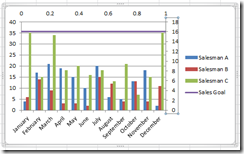
And simply hit Delete on your keyboard. Magically, your graph should now look like this:
![clip_image009[1] clip_image009[1]](https://www.microsoft.com/en-us/microsoft-365/blog/wp-content/uploads/sites/2/migrated-images/44/metablogapi/3515.clip_image0091_thumb_560ECE46.png) .
.
Finally, you’ll probably want to get rid of that stubborn secondary axis on the top of your chart. The easiest way to do this is to right click on the axis and change the font color to match your background—which is this case is just white!
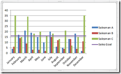
Congratulations- you’ve successfully inserted a horizontal reference line into your chart with a label in the legend! Using this method will maintain your line in the correct position, even if the chart is resized!
—Cathy
Click here for more information on how to create reference lines and related features.
What kinds of uses do you have for this versatile chart element?


