Ah, the great questions of life: Paper or plastic? Line chart or scatter chart? Choosing the wrong chart type for your data can easily happen when it comes to line and scatter charts. They look very similar, especially when a scatter chart is displayed with connecting lines, but there is a big difference in the way each of these chart types plots data along the horizontal and vertical axes. Let Excel writer Frederique be your guide as to which type of chart to use and when.
That’s a good question! Choosing the wrong chart type for your data can easily happen when it comes to line and scatter charts. They look very similar, especially when a scatter chart is displayed with connecting lines, but there is a big difference in the way each of these chart types plots data along the horizontal and vertical axes.
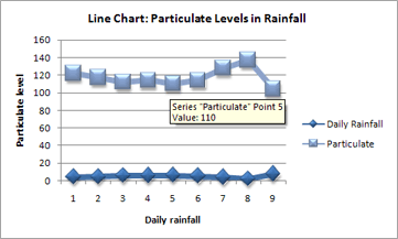
For example, when I use the following worksheet data to create a line chart and a scatter chart, it’s clear that the data is distributed differently in each chart. Without knowing better, we often opt for a line chart, while a scatter chart might be the one we should use instead. Here’s why.
In a line chart, the daily rainfall and particulate values are displayed as two separate data points that are evenly distributed along the horizontal axis. This is because in a line chart, the vertical axis is a value axis and the horizontal axis is a category axis. Instead of displaying values, a category axis shows evenly spaced groupings (categories) of data. Because my data has only values and no categories, Excel automatically generates numbered categories along the category axis, using numbers 1 through 9 in the line chart below.
A scatter chart, on the other hand, has two value axes – it displays values rather than categories on the horizontal axis. Therefore, a scatter chart displays the daily rainfall values as x values on the horizontal axis, and the particulate values as y values on the vertical axis.
And because this chart types has two value axes, it can display a single data point at the intersection of each x and y value (which is the reason why this chart type is often called an xy chart). Depending on the data, these data points are distributed evenly or unevenly across the horizontal axis.
Comparing the two charts above, you can see that the scatter chart depicts my data much better than the line chart.
So how do you know when to use a line or scatter chart?
Line charts can display continuous data over time, set against a common scale, and are therefore ideal for showing trends in data at equal intervals or over time. In a line chart, category data is distributed evenly along the horizontal axis, and all value data is distributed evenly along the vertical axis.
Scatter charts are commonly used for displaying and comparing numeric values, such as scientific, statistical, and engineering data. These charts are useful to show the relationships among the values in several data series, and they can plot two groups of numbers as one series of xy coordinates.
As a general rule, use a line chart when your data includes non-numeric (category) data – if your data contains only numeric values, it is usually better to use a scatter chart.
The following table may further help you decide which of the two chart types is best for your data.
|
Use a line chart if you want to: |
Use a scatter chart if you want to: |
|
|
|
|
|
|
|
|
|
If you want to learn more about these chart types and how to create them, see this article about Available chart types. And check out the blog post on our eight best tutorials on Excel charts.
– Frederique
More info on Excel charts:
Combining Chart Types, Adding a Second Axis
Create a chart from start to finish
Free training: Take the next steps in growing your Excel skills (Lesson 2)
Go beyond the basic chart type
Can’t find the Chart Wizard? No worries
Use sparklines to show data trends
Format column sparkline charts using the date axis and cell merging


