So far, we introduced you to our new chart types across Office 2016 and then dove deeper into a few of them. We showed the effectiveness of the Waterfall chart in visualizing financial statements and how hierarchical chart types, like Treemap and Sunburst, can help you explore complex data with multiple levels and categories. Now, we will take a closer look at the last group of new chart types—statistical charts.
Statistical charts, which include Histogram, Pareto and Box and Whisker, help summarize and add visual meaning to key characteristics of data, including range, distribution, mean and median. There are many different approaches and opinions on how to summarize statistical data. In this blog article, we will explain how these new charts can help represent your statistical data in a way that works best for your needs. Download the Office 2016 Public Preview.
Histogram chart illustrates the distribution of data
The Histogram chart shows the distribution of your data and groups them into bins, which are groupings of data points within a given range. To show in an example, imagine we run a small bookstore and have a list of our entire selection of books and prices.
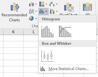
The Histogram, Pareto and Box and Whisker charts can be easily inserted using the new Statistical Chart button in the Insert tab on the ribbon. The Histogram chart is the first option listed.
By creating a Histogram to visualize the above table of data, we can count all the books by bins that represent price ranges. For example, notice that we have grouped all books that are above or equal to $19.95 up to, but not including, $28.95 into one bin. The next bin groups and counts all the books above or equal to $28.95 but less than $37.95 and so on. Notice this grouping as shown in the image below.
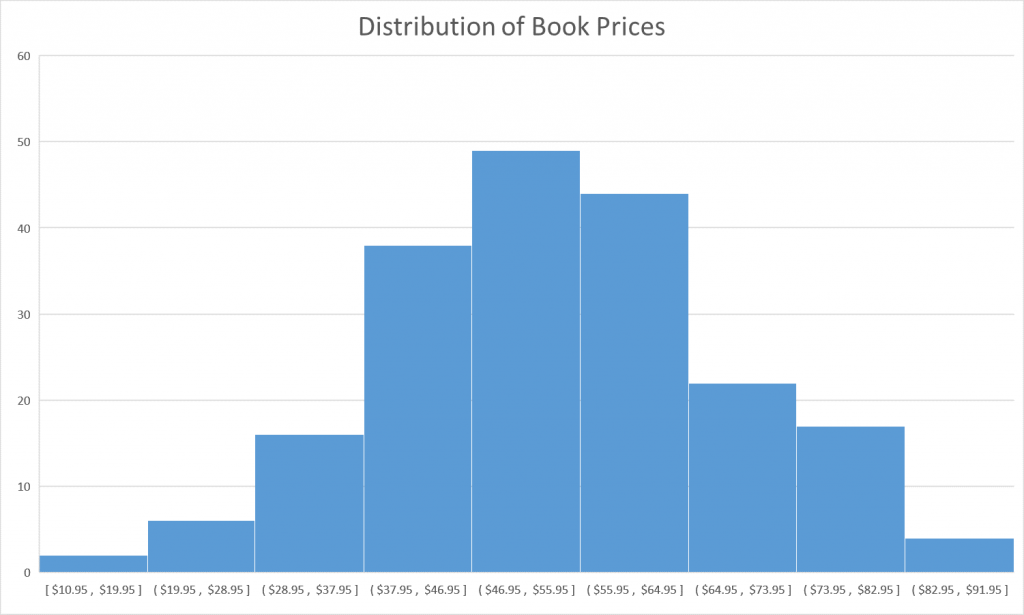
In our design, we follow best practices for labeling the Histogram axis and adopt notation that is commonly used in math and statistics. For example, a parenthesis, “(“ or “)”, connotes the value is excluded whereas a bracket, “[“ or ”]”, means the value is included. So for a bin that groups all the books above or equal to $10.95 but below $19.95, the axis label would look like: [$10.95, $19.95]. In the example above, the first bucket to the left has the label [$10.95, $19.95], which should be interpreted as all values between $10.95 and $19.95, inclusive. This set notation offers the cleanest layout and prevents a cluttered and verbose horizontal axis.
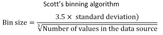
Histogram binning algorithm
In case you’re interested in how we determine the default and automatic bin sizes for the Histogram, we chose to use the widely accepted Scott’s binning algorithm, which calculates the optimal bin size as follows:
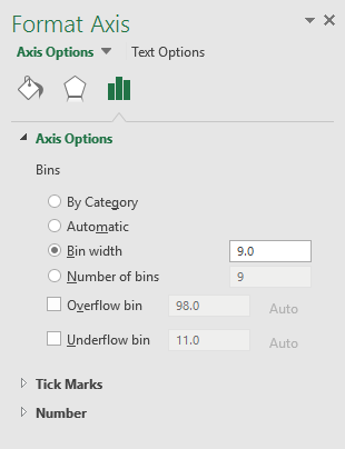
If you want to specify a custom value for bin sizes or create an overflow/underflow bin that groups all the points above/below a certain value, double-click the horizontal axis in your Histogram chart and change the options in the Format Axis task pane.
Gain insights through bin sizes
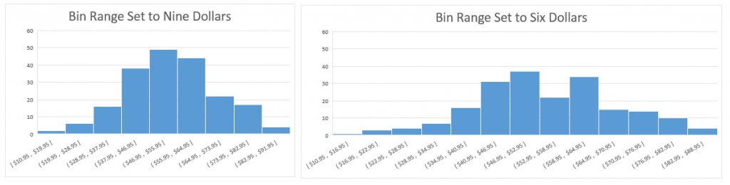
You can gain insights by tweaking the size of the bins. For example, a bin size of 9.0 provides the bell-shaped curve or normal curve, which is seen in the example above. This curve in data is often found in nature, like in measuring the heights of people in a population, recording the IQ scores of a sample of students or determining deviations of a standardized product. At first glance, these book prices also follow a normal distribution. However, by decreasing the bin width to 6.0, the bell-shaped curve breaks down and we quickly notice that books within the price range of [$52.95, $58.95] are fewer than those books in other mid-range prices.
Pareto chart highlights significant data factors
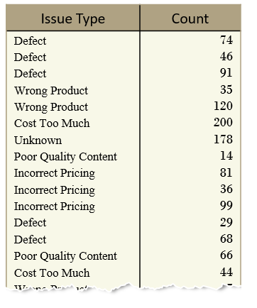
The Pareto chart is useful for figuring out the most significant factors in your data and how they contribute to the entire set. Often used in quality control, the Pareto chart helps easily identify the high use cases, focusing on the big picture, rather than getting lost in the details. The Pareto chart is named after Vilfredo Pareto, most famous for his popular eponym, the Pareto Principle, also known as the 80-20 rule. His principle states that a few reasons (about 20 percent) account for a majority (or about 80 percent) of issues. The Pareto chart shares similarities with the Histogram chart in that each chart displays bins that count the frequency of occurrence. However, for Pareto, the bin is categorical and not a range of values. What also makes the Pareto chart unique is its combination of columns with a line graph, which shows the cumulative contribution of each column as you move from left to right. Looking back at the bookstore example, we have data that lists all the store returns and the underlying reason, whether it was due to defects, incorrect pricing, wrong book, or a host of other causes.
Reading a Pareto chart
Inserting a Pareto chart automatically groups each book return into its proper category and sorts the columns from most common to least common as you traverse left to right. The Pareto chart is supposed to be read so that left vertical axis is associated with the columns, whereas the right vertical axis (in percentage) is associated with the Pareto line. The Pareto line is the running total percentage of all the book returns to the left. For example, the Pareto line starts at the center of the Defect category and intersects the right vertical axis at 40 percent, meaning Defects account for 40 percent of all book returns. Moving along the Pareto line, the next stop is the center of Incorrect Pricing. The Pareto line at Incorrect Pricing intersects the contributing percentage axis at 70 percent, which means that the combination of Defects and Incorrect Pricing account for 70 percent of all book returns. One more category over, Wrong Product intersects the Pareto axis a little bit above 80 percent, which means 80 percent of all book returns are a result of Defects, Incorrect Pricing and Wrong Product.
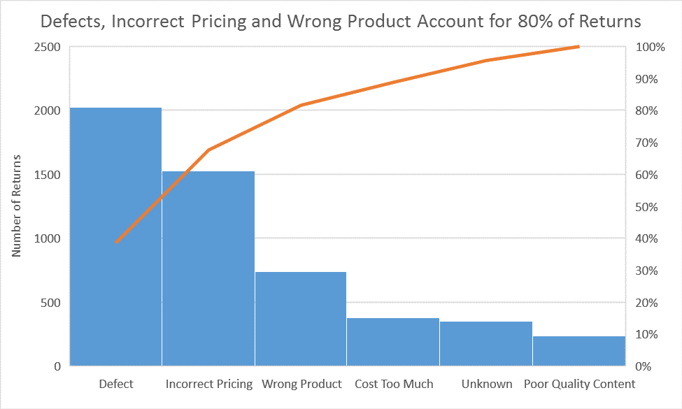
While the Pareto line references the total contributing percentages, the columns represent the frequency or count of the book returns, so while Defects contribute to 40 percent of all book returns, the number of defect books returned is 2,000. The number of books returned for Incorrect Pricing and Wrong Product tally about 1,500 and 750, respectively.
The Pareto chart is useful for discovering areas for improvement or maximizing where the bookstore should allocate its efforts. Targeting improvements to defects and incorrect pricing are more worthwhile than adjusting prices (Cost Too Much) or variety of books (Poor Quality Content).
Box and Whisker characterize the distribution of data
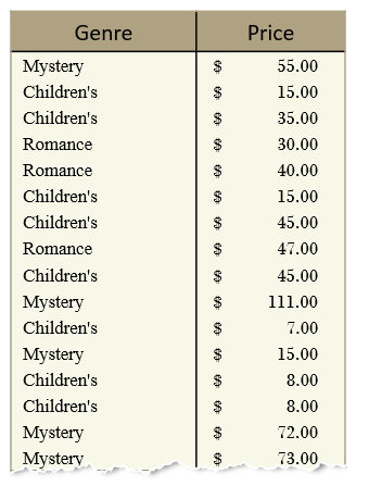
The Box and Whisker chart is designed to quickly and easily highlight important characteristics related to the distribution of your data, by providing basic statistical details like mean, median and percentile groupings, as well as illuminating outliers that exist beyond the general clustering of your data. Additionally, this chart is useful for comparing characteristics between different sets of data. Histogram and Pareto can only provide visualization for one. To illustrate these features, let’s use the bookstore data and we’ll start with a table of book prices within each genre.
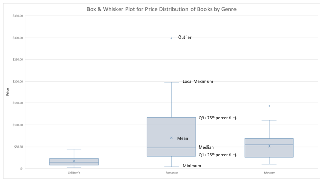
How statistics are used in Box and Whisker
The Box and Whisker chart (above) is helping us visualize statistical characteristics about three separate categories of books—Children’s, Romance and Mystery. Notice that each group is divided into four sections, including a rectangle (the “box”) that is split into two parts and thin T-shaped projections on each end (the “whiskers”). The bottom whisker is called the “Local Minimum.” Just above the whisker is the bottom of the box, which marks the “first quartile.” The values in between the end of the whisker and the bottom of the box are considered part of the lowest quarter of values in the data set. In other words, any book prices found in this section of the visualization are considered part of the lowest 25 percent of the entire collection of prices for that category.
The range from the bottom of the box (or first quartile) to the midline inside the box (representing the median) contains the next 25 percent of listed book prices. From the midline inside the box to the top of the box (the third quartile), there lies another 25 percent of the book prices. Lastly, the distance between the top of the box and the end of the second whisker, barring any outliers, contains the final top 25 percent of the book prices.
The median and mean of each category grouping of book prices are also displayed in the chart. The mean is denoted by the “X” marker in the chart and represents the average of all the data points. The mean is calculated by summing all the data points and dividing by the total number of points.
The median represents the value that is in the middle of the entire set of data, after the set has been sorted from smallest to largest. For example, take the following set of numbers:
1, 2, 5, 7, 10, 14, 15
The median is 7. If this series of numbers were visualized in a Box and Whisker chart, the line drawn in the middle of the box would be at 7.
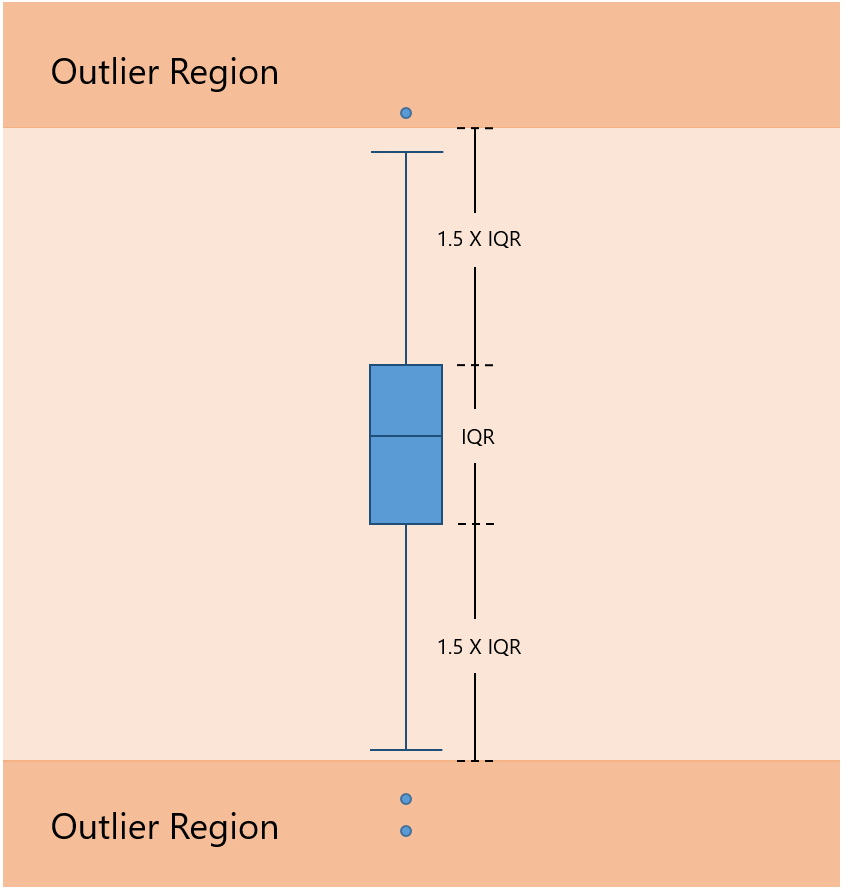
Outliers are points on the Box and Whisker chart that are displayed beyond the end of each whisker. Notice there is an outlier book price within the Romance category. For outliers, we designed the Box and Whisker chart to follow the Tukey industry standard, which states that values are considered outliers only if they lie 1.5 times the length of the box (known as the interquartile range) from either end of the box. The diagram below shows the threshold point to be considered an outlier.
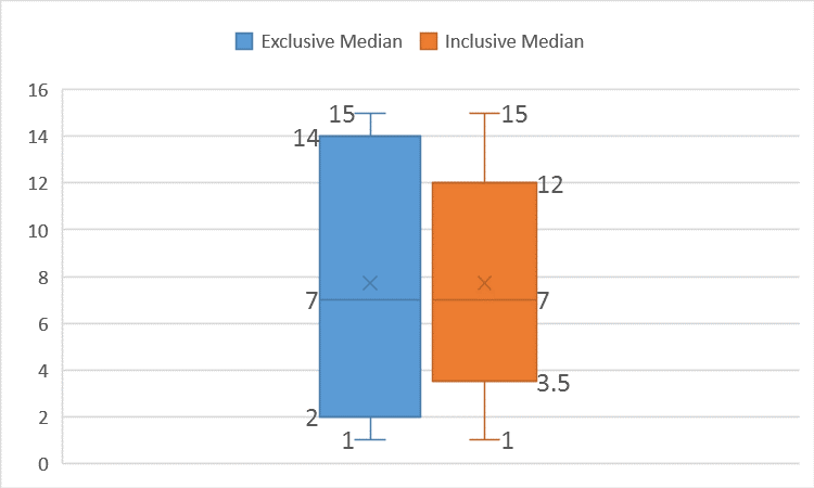
Calculating first and third quartiles with the median
Calculating the first and third quartiles can be a little tricky, depending on how you handle the median. If we wanted to calculate the first quartile to include the median for the sample series of numbers, above, then we would have the following range: 1, 2, 5, 7; where 1 is the minimum and 7 is the included median. Calculating the first quartile would yield a value of 3.5, the midpoint between 2 and 5. If we consider the first quartile without the median, we would be provided the range: 1, 2, 5. In this case, calculating the first quartile would yield a value of 2. So, including or excluding the median as part of the first quartile can significantly impact the value we calculate.
Let’s run the same calculations for the third quartile, just to be comprehensive. If we include the median in the calculation, then we have the following points: 7, 10, 14, 15. In this case, 12 is the third quartile. If the median were excluded in calculating the third quartile, then we would have only 10, 14 and 15 to consider. So the third quartile, in this case, would be 14.
The median is excluded, by default, in the Box and Whisker chart in Excel 2016. Excluding the median in your calculations will always create a larger box relative to a Box and Whisker created with an inclusive mean. The result causes anyone interpreting your chart to believe there are more or less data points near the median for inclusive or exclusive, respectively. Notice in the side-by-side comparison below the different connotations of distribution when the median is excluded or included. To change these settings, double click the Box and Whisker chart to access the Format Data Series task pane.
When to use each chart?
All three new charts provide powerful and easy ways to visualize your data through a statistical viewpoint. However, each chart has unique values that may be useful for different scenarios.
- The Box and Whisker chart is useful for making direct comparisons of data. For example, teachers can plot and share student grades using this chart. In one visual, important attributes—like mean, median and outliers—stand out. Box and Whisker can compare multiple series, side by side, and draw differences between means, medians, interquartile ranges and outliers.
- The Histogram chart takes the Box and Whisker plot and turns it on its side to provide more detail on the distribution. Visualizing a histogram is more intuitive, especially for a normal distribution curve, because it is easy to recognize that many data points exist within a center.
- The Pareto chart is perfect for highlighting which categories contribute the most and by how much. Pareto is a one-click chart creation that automatically sorts the data and shows the proportion to the total.
What do you think?
We just went through the inner workings of each of these statistical chart types and how you can take advantage of each one. Try them out for yourself and let us know what you think. We have finished introducing each of our six new chart types. Download the Office 2016 Preview for Windows to learn more about these new chart types now.
If you have any comments or questions, please feel free to leave them below.
- Learn more about using the Histogram chart.
- Learn more about using the Pareto chart.
- Learn more about using the Box and Whisker chart.