There are lots of reasons to spend time styling your document – you may be trying to follow a publishing requirement, to make your document stand out, or just make it easier to read. In Word 2013, we’ve made it easier than ever for you to quickly change the look of your entire document until you have it just right. While the styles gallery has been available on the Word home tab since Word 2007, some people just assume styles are meant for people who want big blue text. As it turns out, that’s not true. I’m here to tell you that Styles are handy, and if you use them to format your text as your write your document, you’ll be able to take full advantage of the improvements in Word 2013.
Today’s post comes from Caitlin Ashley-Rollman, the program manager who has brought a whole new style to Word.
For as much time as people spend writing documents in Word, we know that users also spend lots of time formatting their documents to get them to look exactly as they want. There are lots of reasons to spend time styling your document – you may be trying to follow a publishing requirement, to make your document stand out, or just make it easier to read. In Word 2013, we’ve made it easier than ever for you to quickly change the look of your entire document until you have it just right.
Using styles
While the styles gallery has been available on the Word home tab since Word 2007, some people just assume styles are meant for people who want big blue text.

As it turns out, that’s not true. I’m here to tell you that Styles are handy, and if you use them to format your text as you write your document, you’ll be able to take full advantage of the improvements in Word 2013 that we’ve outlined below.
The new design tab
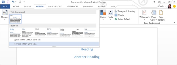
In the past, document level formatting features in Word were scattered in the UI – from the Change Styles menu on the Home tab to the Themes gallery on the Page Layout tab, our first task in Word 2013 was to bring commands together into a unified Design tab – your first stop for adjusting the look of your whole document:

On this tab are all the features that change the look of your entire document (without you needing to select it). It’s perfect for those times when you realize you’ve written your entire document in Calibri but you really want it in Garamond, or for those of you who’d prefer to have no spacing between lines or paragraphs of text. You can even change all the colors in your document at once.
Use the tab before you create your document if you want to write it in your final font & color combination, or use it after you’re done to watch your document transform before your eyes.
Style Sets gallery
One of my favorite new design features is the visual gallery for Word’s Style Sets. (For those of you who are new to Style Sets, I’ll explain them in more detail further down.)

Our goal here was to give you a sense for each choice by showing you a pictures of the Title, Heading 1 and some body text. By making them a large gallery, you can quickly experiment with them to find which one you want – in just one click you can go from a casual multicolored document to a professional looking black and white document with numbered headings. As a bonus, you can hover over the ones you’re curious about to see how they’ll change your document before you apply the formatting.
New Style Sets
Once we had created the Design tab and style sets gallery, we decided to refresh the sets themselves to ensure the various options provided in Word 2013 be both modern and varied. To do this, we worked to come up with a group of designs that are perfect for common scenarios (essays, lab reports, books, legal documents, etc.). We focused on designs that were clean and simple with a few bits of flair. We wanted enough variety so you could find something that fit whatever document you were creating, but not so much variety that you’d never even consider half of them. And don’t worry – if you love the default look in previous versions of Word, those are still there too.
Getting it “Just right”
We know there will be times when none of the default style sets are quite right. Perhaps you’ll want the headings a little smaller or you need them centered.
For example, if you want to make your own Style Set where Heading 1 is centered, you can apply Heading 1 to some text, center it, then right-click on Heading 1 and choose “Update Heading 1 to match selection.”

Once you have the look you want, you can return to the Design tab and open the Style Sets gallery to find the “Save as new style set button.” This will let you save your custom design for future documents.
What do these settings actually do?
While these features aren’t new to Office 2013, we are making them more visible, so it seems like a good time to explain how each of the buttons in the Document Formatting chunk will affect your document.
Themes

The Themes button is a big switch that changes Colors, Fonts and Effects at once.

This makes it easy to change many attributes at the same time or to match your Word document to your PowerPoint deck. Keep reading to learn how each of these options changes your document.
Style Sets

Similar to Themes, Style Sets act as a big switch and have a large effect on the look of your document. The way I like to think of them is that they change the Font & Paragraph properties of the text in your document. Essentially, anything in these sections:

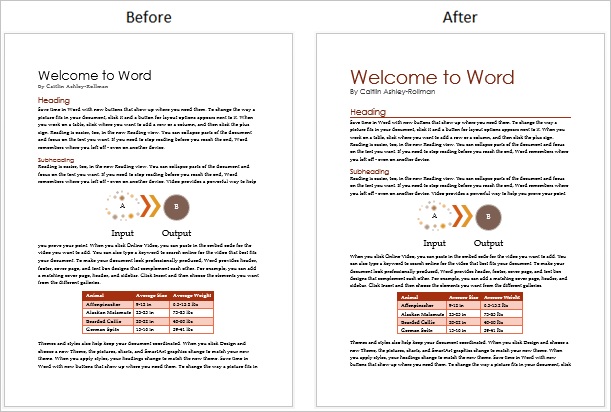
That said, we like to preserve the benefit of the Theme buttons described above, so we generally don’t change the font in Style Sets and when we change the color, we stay within the Theme Colors section of the color palette. For example, in this document I switched to a Style Set with a large red title and a line under Heading 1 to create a completely different look:
Theme colors

Theme colors (also described as your color scheme) set the colors used in your document. A few places where you’ll notice this change are:
- The Theme Colors available in the color dropdown
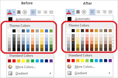
- Anything that uses Theme Colors including shapes, SmartArt, charts and text.
- Any tables that are formatted using a colored table style
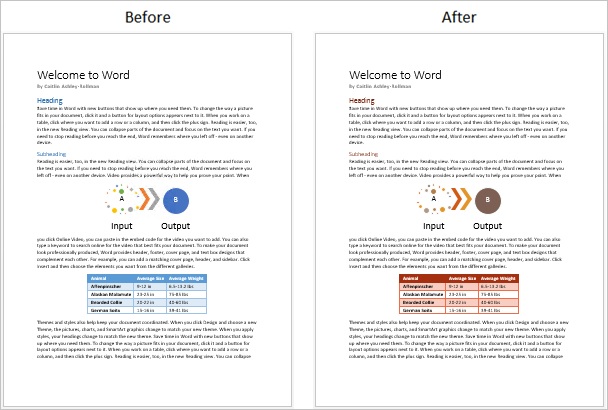
For example, if you really like Red, you may choose to change your color scheme from Office to the “Red” scheme:
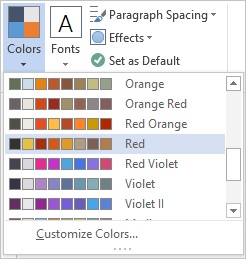
which changes your document like this:
Theme fonts

Theme fonts (similarly, sometimes described as your font scheme) set the font used by all the text in your document. It will change any text that is formatted using the fonts that have “(Heading)” or “(Body)” next to their name:

While you can use the font dropdown on the Home Tab to achieve the same result, here are a few good reasons to change your font using the Theme Fonts gallery:
- You don’t have to worry about selecting all your text. (Have you ever ended up with you text in one font but when you start typing your next paragraph it’s wrong again? Ugh.)
- You don’t have to worry about avoiding text that you want in a different font (ex. Headings, a quote or perhaps a piece of code).
- You don’t have to make sure other people who are working in your document use the correct font. It’ll just happen naturally.
- If you have a favorite font set, you can create your own font scheme so you don’t have to remember it every time. (Just click the Customize Fonts button and select your favorite fonts.)
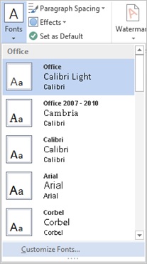
- Last but not least, you can change your default font so it’s the font for all new documents you create. (See the “Set as Default” section below)
For example, if you really want a serif font with a san-serif heading, you may choose to change the Theme Font from Office to Century Gothic – Palatino Linotype,
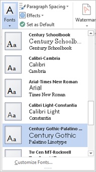
which changes your document like this:

Paragraph spacing

The Paragraph Spacing gallery is perfect for changing the spacing between lines of text or paragraphs. It will update the spacing in your entire document (unless you have applied direct formatting using the Paragraph settings on the Home tab). For example, if you want to remove all the spacing that Word adds by default, you can do that by selecting the “No Spacing” option.
Theme effects

Theme Effects change the look of Shapes, Charts and SmartArt in your document by adding shadows, outlines, gradients and other interesting visual effects. The amount that they change will depend on the styles of the object and the Theme Effect applied. Some are more subtle then others.
Set as default

Last but not least, the Set as Default button is there so you can make these settings your default settings for all new blank documents. It will save your current:
Theme
- Theme Colors
- Theme Fonts
- Theme Effects
- Style Set
- Paragraph Spacing
If you want to make sure you don’t accidentally save the wrong settings, I recommend you start with a blank document and only change the settings you care about before saving them as your default.
Summary
In short, you can give your document an entirely new personality. Just make sure to format with Styles as you write then play with the options on the Design Tab until your document shines.
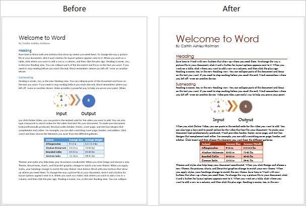
This is my before and after comparison:
What’s yours?

The Design Tab feature crew is so excited to bring you an easier way to make your documents look great!

