Summary Welcome to the Power Platform monthly feature update! We will use this blog to share news in Power Platform from the last month, so you can find a summary of product, community, and learning updates from Power Platform in one easy place. Now, let’s dive into what’s new in Power Platform:
Get started with the latest updates today!
Jump into Power Apps, Power Automate, and Power Pages to try the latest updates, you can use an existing environment or get started for free using the Developer plan.
Power Apps
Generally available: Power Fx user defined types (UDTs)
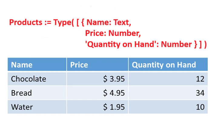
User defined types (UDTs) are now generally available, as of version 3.26044. They are enabled for all new apps and can be enabled for existing apps through settings > updates > new > user-defined types. UDTs are defined with the Type function in the App.Formulas property.
UDTs enable user defined functions (UDFs) to pass complex data structures in and out of your own functions such as records and tables. For example, with the UDT definition Point := Type( { x: Number, y: Number } ); and UDF definition Distance( to: Point, from: Point ) : Number = Sqrt( (to.x – from.x)^2 + (to.y – from.y)^2 );, the formula Distance( {x:0,y:0}, {x:3,y:4} ) returns 5.
UDTs also enable the strong typing of JSON with the ParseJSON function, providing basic data type validation and simplifying coercions. For example, with the UDT definition Person := Type( { Name: Text, Birthday: Date } ); the formula ParseJSON( “{ “”Name””: “”Fred””, “”Birthday””: “”2001-01-01”” }”, Person ) will validate that the birthday is in the proper format and will convert to a Power Fx strongly type date, allowing date functions such as Weekday to be used (for this example, correctly returning 2).
Agentic apps
Public preview: custom tools and rich UI for app-based conversations
We’re introducing custom tools and rich UI for app‑based conversations in Power Apps, now in public preview, building on the broader April 2026 updates to Microsoft Power Platform. This release extends how model‑driven apps integrate with Microsoft 365 Copilot, enabling more contextual, visual, and action‑driven experiences that move beyond basic data access toward collaborative workflows inside Copilot.
With this capability, makers can now define custom MCP-powered tools that bring app-specific business logic into Copilot, alongside interactive, Fluent‑based UI widgets that present insights and guide next steps. These components integrate directly into the app’s MCP server and declarative agent, allowing Copilot to dynamically orchestrate actions, combine data, and deliver richer, more guided experiences — all through natural language interactions.
AI powered development
Input support for generative pages
Generative pages can now accept context passed in as input, so a page can open already aware of the record the user is working with or any other custom data your scenario needs. That single change unlocks a much broader set of places generative pages can live inside a model-driven app.
Until now, generative pages were primarily limited to standalone, top-level experiences off the sitemap. With input support, you can now launch a generative page from a command bar button, a grid row action, a sub grid navigation, or any other in-app entry point, and the page receives the record context it needs to render the right view.
A few scenarios are still on the way: opening generative pages in side panes, and adding them as tabs or sections within forms via the form designer. We’re working on those for the next quarter.
Other notable improvements
- Add an existing generative page to an app: The ‘add a page’ flyout now lets makers pick an existing generative page from the environment instead of always creating a new one, making it easy to reuse a page across multiple apps.
- Generative pages in the Power Apps mobile app: Generative pages now display as expected in the Power Apps mobile app. Offline support is not yet available.
- Code diff across sessions: The code diff view now works correctly when resuming an editing session, giving makers a continuous view of how a page has evolved across multiple sittings.
Migrate your InfoPath forms to Power Platform with coding agents
For years, InfoPath has powered business-critical forms across organizations. With InfoPath now retired, makers face the challenge of opening each .xsn, mapping every control, rewiring every data connection, and recreating every rule by hand.
With the Canvas Authoring MCP Server and the PowerCAT Skill for InfoPath Migration, makers can now use their preferred AI coding agents – GitHub Copilot, Claude Code, or any MCP-compatible assistant – to migrate InfoPath forms into Power Apps Canvas Apps through natural conversation.
The PowerCAT InfoPath Migration Skill teaches your coding agent how to read and interpret InfoPath artifacts. It unpacks the .xsn cabinet, parses the underlying XSN/XSF/XSD definitions, and produces a structured intermediate representation of the form: views, fields, data sources, rules, validations, and submit behaviours. The Canvas Authoring MCP Server then creates appropriate controls, sets properties and formulas, inspects SharePoint lists chosen as the new backing store, and emits structured, validated YAML for each screen. The maker can also continue editing and publishing the app from the Power Apps studio.
Building modern apps
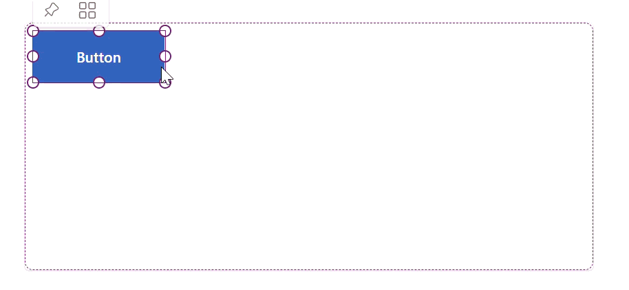
Modern control updates for Button, Slider, Icon, and Dropdown with Icon now supporting OnSelect
The modern Button, Slider, Icon, and Dropdown controls are now GA-quality, with focused improvements based on maker feedback. The headline change is OnSelect on the Icon control, one of the most-requested capabilities on modern icon, letting an icon directly trigger actions without overlaying a transparent button. Icons set with OnSelect now render with proper button semantics, including keyboard and screen reader accessibility.
The Dropdown control on desktop now opens a Fluent-themed flyout that matches your app’s visual theme, replacing the browser’s native picker for web. Button and Slider received border, padding, and font property parity with other modern controls. The Slider handle and track render cleanly at all sizes, and Button hover, pressed, and disabled states are visually consistent.
One-click updates on old controls are yet to roll out.
Generally available: Grid container with drag-and-drop authoring and full undo/redo
The Grid container control is now generally available. Grid container is the modern, CSS grid–style layout container that replaces heavy X/Y absolute positioning. Makers can define rows and columns and place child controls using Row Start/End and Column Start/End, with span support. This eliminates most container nesting and the formulas previously needed to make canvas layouts responsive.
The GA release includes major authoring improvements shipped over the last several weeks. Makers can now drag controls directly into grid cells, resize controls using span handles, and rely on full undo/redo support for both drag and resize actions. Controls can also overlap temporarily during repositioning, removing the previous forced delete-and-read workflow. Scroll-aware hit-testing means drag interactions work correctly even when the grid scrolls.
Public preview: New Data Grid control – a Fluent UI based grid with search, sort, and multi-select for high-density data
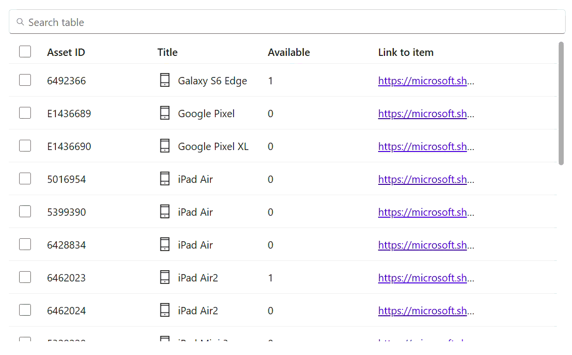
The new Data Grid modern control enters public preview as a high-performance, data-dense view for tabular data. Built on Fluent UI, Data Grid supports searchable rows (with a built-in search bar above the grid and a SearchText output property), sortable columns, multi-row selection, and configurable column sub-controls including Text, Number, Phone, Email, URL, and Button column types. Columns are added automatically when you connect a data source, and properties can be unlocked for per-column customization.
Known preview limitations: attachment-type columns from Dataverse are not yet supported, and row virtualization for large datasets is not yet available. Both are planned and coming in the next few weeks.
Learning updates
Training paths and labs
Updated training
- Automate repetitive tasks using loops in Power Automate desktop app
- Automating email handling in Power Automate desktop app
- Build expertise with Power Automate desktop app
- Create components with Power Apps Component Framework
- Deploy and refine your app like a pro
- Design your app like a pro
- Excel automation in Power Automate desktop app
- Get started with Power Automate desktop app
- Handle variables in Power Automate desktop app
- Plan your project like a pro
- Power Automate desktop app development essentials
- Scripting in Power Automate desktop app
- Take your first steps with Power Automate desktop app
- Work with different technologies in Power Automate desktop app
- Work with Power Automate desktop app
Power Apps maker
New
- Create and edit canvas apps with AI code generation tools
- Data Grid modern control in canvas apps – Power Apps
- Enable your app and custom tools in Microsoft 365 Copilot
- Generate MCP App widgets with AI code generation tools
- Icon modern control in canvas apps – Power Apps
Updated
- Add a Copilot control to a canvas app (preview)
- Add a custom Copilot to a canvas app
- Add a custom page to your model-driven app
- Add agents to your model-driven app
- Add and configure the timeline control in Power Apps
- Add Microsoft 365 Copilot chat for app users in canvas apps (preview)
- Add Microsoft 365 Copilot for app users in model-driven apps
- Add the rich text editor control to a model-driven app
- Azure Synapse Link Advance Configuration
- Azure Synapse Link for Dataverse
- Behavior and format of the Date and Time columns
- Build apps and take action with insights from Microsoft Fabric
- Build apps through conversation with Copilot
- Button Modern Control in Canvas Apps: Properties and Examples
- Change the color scheme or add a logo to match your brand
- Column data types in Microsoft Dataverse | MicrosoftDocs
- Combo box modern control in canvas apps – Power Apps
- Command bar customization limitations
- Complete guide to building canvas applications
- Configure a row summary for a model-driven app
- Configure header properties in the form designer
- Configure real-time workflow stages and steps in Power Apps
- Configure the Dataverse model context protocol (MCP) server
- Configure your environment and link to Microsoft Fabric
- Connect Dataverse MCP with GitHub Copilot in Visual Studio Code and Copilot CLI
- Create a business rule in Microsoft Dataverse
- Create a choice column
- Create a Power BI report using the Microsoft Dataverse connector
- Create a relationship between tables by using a lookup column
- Create an Azure Synapse Link for Dataverse with Azure Data Lake in Power Apps
- Create and configure model-driven app interactive experience dashboards
- Create and edit generative pages with AI code generation tools
- Create and edit virtual tables with Microsoft Dataverse
- Create and use business skills
- Create model-driven app business rules and recommendations
- Create new data columns in Dataverse
- Create or edit a model-driven app view in Power Apps
- Create or edit model-driven app dashboards
- Create virtual tables using virtual connectors in Microsoft Dataverse
- Customize Microsoft 365 Copilot in Power Apps
- Dataverse long term data retention overview
- Define rollup columns with Power Apps | MicrosoftDocs
- Dropdown modern control in canvas apps – Power Apps
- Embed a Power BI report in a model-driven app main form
- Generate a page using natural language with model-driven apps in Power Apps
- Limitations and troubleshooting virtual tables with Power Apps
- List of controls available for model-driven apps | MicrosoftDocs
- Manage access to public system views
- Manage model-driven app settings in the Power Apps app designer
- Model-driven app glossary of terms
- Modern controls and properties in canvas apps
- Power Apps grid control in Power Apps
- Privileges required for customizing apps build on Dataverse
- Recent modern control updates in canvas apps – Power Apps
- Restricted tables requiring Dynamics 365 licenses | Microsoft Docs
- Set a data retention policy for a table
- Slider modern control in canvas apps – Power Apps
- Steps to building a model-driven app
- Supported functions in Microsoft Dataverse
- Tables and metadata in Microsoft Dataverse
- Text modern control in canvas apps – Power Apps
- Troubleshooting common issues with link to Fabric with Microsoft Dataverse
- Understand canvas-app forms
- Understand data cards in Power Apps canvas apps
- Understand data sources for canvas apps
- Use data source environment variables in canvas apps
- Use environment variables in Power Automate solution cloud flows
- Use modern themes in Power Apps
- What is Dataverse intelligence?
- Work with Dataverse data in Fabric and generate Power BI reports
- Work with Power Apps MCP server
Updated
- AI features overview
- Find data in a view with AI
- Supervise agents in model-driven apps with agent feed
- Use AI form fill assistance in model-driven apps
- Use Microsoft 365 Copilot in canvas apps (preview)
- Use row summaries in model-driven apps
- View the profile card for a contact or user | MicrosoftDocs
- View, compose and respond to email | MicrosoftDocs
- Visualize data in a view with AI
Power Automate
New
Updated
- Allow list tenants for registration and connect with sign-in connections
- Change the timeout configuration for the UI/Browser automation
- Create and manage test cases for desktop flows
- Create desktop flows using Record with Copilot (preview)
- Handle errors in desktop flows
- List of aggregations
- Power Automate v2 schema
- Run desktop flow actions reference
- Trigger flows when a row is added, modified, or deleted
- Troubleshoot unattended desktop flow execution failures
Power Pages
New
Updated
- Add AI features in a list (preview)
- Add forms
- Available Liquid objects
- Configure Power Automate cloud flows in Power Pages
- Create a site with Power Pages
- Create and assign web roles
- Get started with the Power Pages plugin for GitHub Copilot CLI and Claude Code (preview)
- How server-side caching works in Power Pages
- Invite contacts to your Power Pages site
- Liquid overview
- Manage SharePoint documents
- Manage website authentication key
- Migrate Power Pages website configuration
- Power Pages architecture
- Power Pages lifecycle
- Provide access to external audiences
- Roles required for Power Pages administration
- Set up a SAML 2.0 provider with Microsoft Entra ID
- Set up an OpenID Connect provider
- Set up an OpenID Connect provider with Microsoft Entra ID
- Set up Power BI integration
- Style your Power Pages site
- Use @powerpages within GitHub Copilot Chat for Visual Studio Code (preview)
- Use the admin center
Power Platform administration
New
- Admin user management unification for finance and operations in Power Platform admin center (preview)
- Create Entra agent users (preview)
- Solution YAML source control format reference
- Synchronize data across Dataverse environments using Power Platform
- Telecom provider mobilezone modernizes service delivery using Microsoft Copilot Studio
- Tiendas CUADRA delivers always-on customer service and product discovery with Copilot Studio
- Upload files to SharePoint with metadata from model‑driven apps
- Automate vendor invoice processing with Power Automate and AI Builder
Updated
- Advanced connector policies (preview)
- AI-assisted test authoring with GitHub Copilot (deprecated)
- ALM in Power Platform with Test Engine (deprecated)
- Authentication Guide for Power Apps Test Engine (deprecated)
- Authentication in Power Apps Test Engine (deprecated)
- Authentication security architecture in Test Engine (deprecated)
- Automatic deletion of Power Platform environments
- Column-level security
- Concentrix modernizes invoice processing with Power Platform and AI
- Connector action control
- Connector classification
- Control which apps are allowed in your environment
- Copilot Studio agents inventory schema
- Create a C# Power Fx test function (deprecated)
- Create users
- CRM data migration to Dataverse: Key insights and best practices
- Data migration approaches
- Data migration planning for go-live
- Data policies
- Dataverse and Connector Simulation with Test Engine (deprecated)
- Degrees of Change automates nonprofit operations with Power Apps, Power Pages, and AI Builder
- Delete unlicensed or removed Microsoft Entra group users
- Design scalable integrations with Power Automate
- Determine integration requirements
- Explore integration patterns
- FAQs about source code integration
- File access restrictions for Test Engine (deprecated)
- Generative AI capabilities in Power Apps Test Engine (deprecated)
- Licensing
- Manage and govern the default Power Platform environment
- Manage application users in the Power Platform admin center | MicrosoftDocs
- Manage Copilot Studio credits and capacity
- Manage data policies
- Manage Dataverse auditing
- Manage feature settings
- Metrics and recommendations for Power Apps
- Microsoft Dataverse reference architectures and solution ideas
- Model Context Protocol in Test Engine (deprecated)
- Modernize applications with Power Platform
- Move data across regions for Copilots, AI agents, and generative AI features
- Overview of admin notifications and announcements (preview)
- Overview of Power Platform activity logging and auditing in Microsoft Purview
- Overview of Power Platform and Copilot Studio reference architectures
- Overview of unified admin experience for finance and operations apps
- Patch function
- Power Apps reference architectures and solution ideas
- Power Apps Test Engine features (deprecated)
- Power Apps Test Engine overview (deprecated)
- Power Apps Test Engine Power Fx (deprecated)
- Power Apps Test Engine Power Fx Functions (deprecated)
- Power Apps Test Engine Samples (deprecated)
- Power Apps Test Engine YAML format (deprecated)
- Power Automate licensing FAQ
- Power Automate reference architectures and solution ideas
- Power Platform and Copilot Studio real-world case studies
- Power Platform inventory
- Power Platform inventory API
- Power Platform inventory schema reference
- Power Platform Well-Architected pillars and data migration
- Power Platform white papers
- Programmability and extensibility
- Programmability and extensibility – What’s new or changed
- Recommendations for implementing automation
- Restore deleted Microsoft Dataverse table records
- Revolutionize vehicle inspections with EVVIE
- Role-based security roles for Dataverse
- Rules for environment groups
- Security and governance considerations in Power Platform
- Security overview
- Set up virtual network support for Power Platform
- Singapore Civil Defence Force implements digital solutions using Power Platform and Copilot Studio
- SolutionPackager tool (Microsoft Dataverse) | Microsoft Docs
- Source control with solution files with Microsoft Dataverse in Power Platform
- Suggested workflow for a complex data migration
- Tenant-to-tenant migrations
- Test canvas applications with Test Engine (deprecated)
- Test command migration process for Test Engine (deprecated)
- Test Dataverse extensions with Test Engine (deprecated)
- Test Engine and Playwright Integration (deprecated)
- Test Engine extensibility (deprecated)
- Test Engine feature lifecycle (deprecated)
- Test Engine module functions reference (deprecated)
- Test model-driven applications with Test Engine (deprecated)
- Testing nondeterministic AI in Power Apps (deprecated)
- Tutorial: Copy a Lifecycle Services environment to a unified environment | Microsoft Docs
- Tutorial: Schedule environment copy and automated data import using Azure DevOps
- Understand your security posture and challenges
- Understanding Test Engine providers (deprecated)
- Unified environment types and templates for finance and operations apps
- Use a staging database for data migration
- Use Power Fx namespaces in testing (deprecated)
- Use Word templates to create standardized documents
- View license consumption for Power Apps (preview)
- View Microsoft Dataverse and model-driven app activity logs in Microsoft Purview
- View Power Apps activity logs in Microsoft Purview
- View Power Automate activity logs in Microsoft Purview
- View Power Pages activity logs in Microsoft Purview
- View Power Platform admin activity logs in Microsoft Purview
- View Power Platform connector activity logs in Microsoft Purview
- What’s new in Microsoft Power Platform adoption guidance
- What’s new in the Power Platform and Copilot Studio Architecture Center
Power Platform developer
New
- Add Power Automate flows to a code app (preview)
- Navigate to and from a generative page using client API
Updated
- Advanced testing capabilities for Power Platform Playwright samples
- AI test authoring with Copilot for Power Platform Playwright samples
- AI-Assisted Testing Overview for Power Platform Playwright
- API reference for Power Platform Playwright samples
- API testing through form context in Power Platform Playwright samples
- Asynchronous service (Microsoft Dataverse) | Microsoft Docs
- Authentication guide for Power Platform Playwright samples
- Authentication Overview for Power Platform Playwright Samples
- Browse Table Definitions in Your Environment
- CI/CD integration for Power Platform Playwright samples
- Community Tools for Microsoft Dataverse
- Configuration reference for Power Platform Playwright samples
- Continuous integration and deployment
- Custom instructions for AI agents in Power Platform Playwright samples
- Environment variables reference for Power Platform Playwright samples
- Get Started With Power Platform Playwright Samples
- Global setup and teardown in Power Platform Playwright samples
- Grant limited access to Dataverse files using shared access signatures
- How to: Add a Dataverse action or function to your code app
- How to: Configure Content Security Policy
- How to: Connect your code app to data
- How to: Connect your code app to Dataverse
- How to: Quickstart with npm CLI (preview)
- Locators in Power Platform Playwright samples
- Microsoft Power Platform CLI admin command group| Microsoft Docs
- Microsoft Power Platform CLI auth command group| Microsoft Docs
- Microsoft Power Platform CLI model command group| Microsoft Docs
- Microsoft Power Platform CLI pages command group| Microsoft Docs
- Microsoft Power Platform CLI solution command group| Microsoft Docs
- Migrate from Power Apps Test Engine to Power Platform Playwright samples
- Open apps, forms, views, and reports with a URL
- Page Object Model for Power Platform Playwright samples
- Playwright MCP server for Power Platform Playwright samples
- Power Apps code apps overview
- Power Platform Playwright Samples Overview
- Register a plug-in (Microsoft Dataverse) | Microsoft Docs
- Restore deleted records with code
- Sample tests for Power Platform Playwright samples
- Send in-app notifications within model-driven apps
- Test AI-generated apps (Gen UX) with Power Platform Playwright samples
- Test Canvas Apps with Power Platform Playwright Samples
- Test Custom Pages in Model-Driven Apps With Power Platform Playwright Samples
- Test model-driven apps with Power Platform Playwright samples
- Web API EntityTypes
- Web API navigation properties
- Write, debug, and run tests locally with Power Platform Playwright samples
- PowerApps-Samples repo: 50 new code samples for .NET Core
Power Platform connectors
Updated