React (virtual) and Fluent UI code components using platform libraries
React based virtual code components are finally here!
Today we’re pleased to announce the Public Preview availability of React based virtual code components. 1st and 3rd party developers now have the ability to make use of platform provided libraries to build their diverse set of code components. No more React or Fluent library packaging inside individual component bundles. No more mismatched control styles across multiple apps and app types – model-driven or canvas. No more isolated component React trees. Code components can now use one common set of platform provided React and Fluent UI React libraries.

What are React (virtual) code components?
Power Apps component framework currently only supports standard code components (standard html control types). Controls are allocated an HtmlDivElement in it’s init lifecycle method and mounts its UX/UI inside the allocated Div directly working on DOM . On the other hand, React which is an open-source JavaScript library for building front end user interfaces uses a virtual DOM. React (virtual) controls provide a new pattern optimized for using React library in code components to get the most performance benefits and better align with the React patterns by attaching the control’s React root to the platform React tree. With this feature, virtual code components can have performance gains which are at par with some of the 1st party controls.
How do I create React (virtual) component?
We have added a new optional parameter to Power Apps Component (PAC) CLI. A new --framework (-fw) parameter for the pac pcf init command. If you set the value of this parameter to react, a simple Hello World virtual control is created. This control will have control type specified as virtual in it’s control-manifest along with the React and Fluent platform library resource declarations. You can quick try this control locally using test harness npm start – without having to create a solution and add it to Dataverse. Test harness provides runtime libraries for externalized React and Fluent UI libraries, inline with the Power Apps runtime where control will eventually be used.
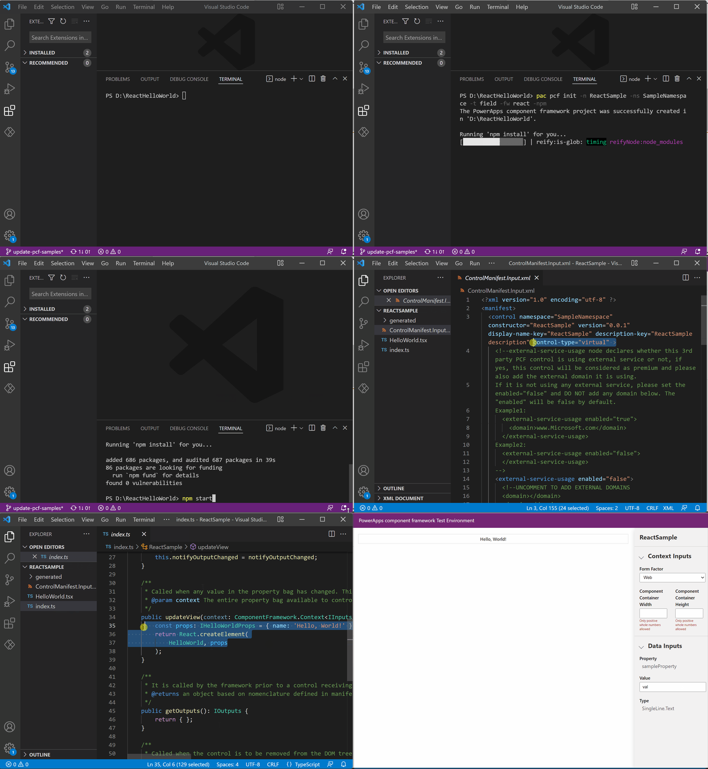
Creating a React (virtual) code component
What is Fluent Design System?
Fluent Design System is an open-source, cross-platform design system that gives designers and developers the frameworks they need to create engaging product experiences—accessibility, internationalization, and performance included. Fluent UI controls were first released in Power Apps for Teams and as the default controls for Custom pages. Fluent not only helps Power Apps align design across Microsoft products but also provides a strong foundation for Theming and design Infrastructure.
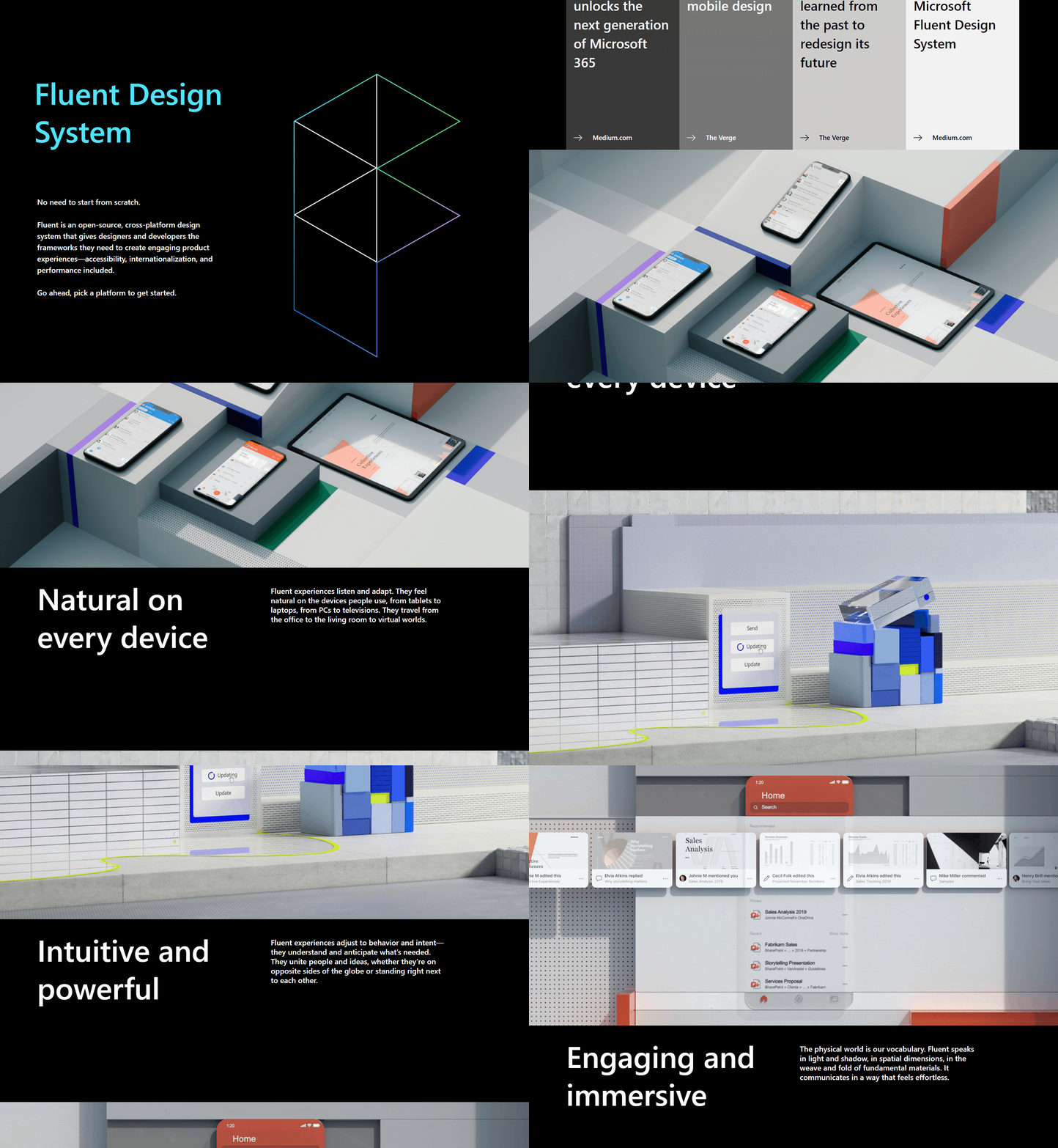
Fluent Design System
How do I create a virtual Fluent component?
Creating a virtual Fluent component is essentially the same way you create a virtual control. New framework parameter mentioned above adds a shared library resource definition for both Fluent and React to the control’s manifest. By default the Fluent UI React library will be available to control, if it is not needed for a particular project you should remove this node.

Platform Libs in component manifest
Where can I find sample React (virtual) and Fluent UI code components?
We are sharing two new virtual control samples which are updated versions of our existing samples. New Choice picker component and React FacePile component provide the same functionality but are React (virtual) controls which use platform libraries. You can use these controls as a starter project or for further explorations.
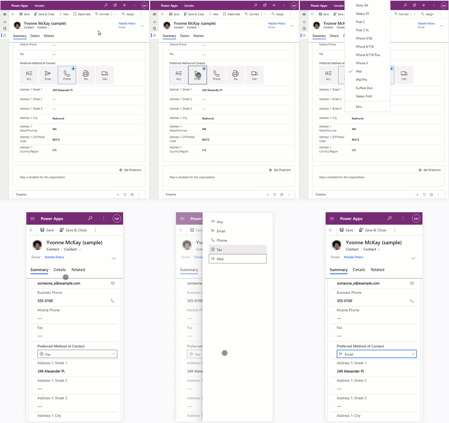
Choice picker component
Performance considerations
You can expect much better performance across web and mobile, especially on slower networks. Following are some high-level numbers comparing standard and virtual versions of FacePile control on development machine.

Going forward
At GA, React and Fluent UI will be the recommended and default way to create all code components. We recommend starting to evaluating React + Fluent controls for building Power Apps code components. For production use, developers should consider utilizing the standard control library packaging mechanism during our preview phase. You can see a sample showcasing the pattern here. Post GA, migrating to virtual controls should be simple as the core client development stack is the same.
You can find more details about this feature in our preview documentation for React controls & platform libraries. Looking forward to great community adoption and feedback. Please use Power Apps Pro Dev forum for any questions.

