App Creation Tips: Best Practices in App Icon Design
As your PowerApps grow in the number, the value of the App Icon will become increasingly obvious. When people are looking through the PowerApp player on their mobile phones, as well as when they are browsing organizational apps in the web browser, we call attention to our apps first by the visual icon, then by the name and author. We want to practice consumer-focused ‘design empathy’ when creating and publishing app icons. This is because each app icon helps them to identify value and to memorize tasks which are associated with the growing number of apps that they will discover every day.
![]()
Here are 4 important ways you can inspire others to notice, and to open your app:
1, Create icons that reflect the purpose of the app. An app with a fork and knife image clearly indicates that the app has something to do with food. So be aware that the app icon can convey purpose, as well as brand value.
2, Keep it simple for scale. Keep icons simple enough to remain clear, whether they are viewed in app documentation, or in the players, and even when pinned to the home page of a mobile device. Remember that text can be challenging to read at small scales, so keep text on icons to a minimum, and when included keep the font style clean and easy to read at all scales.
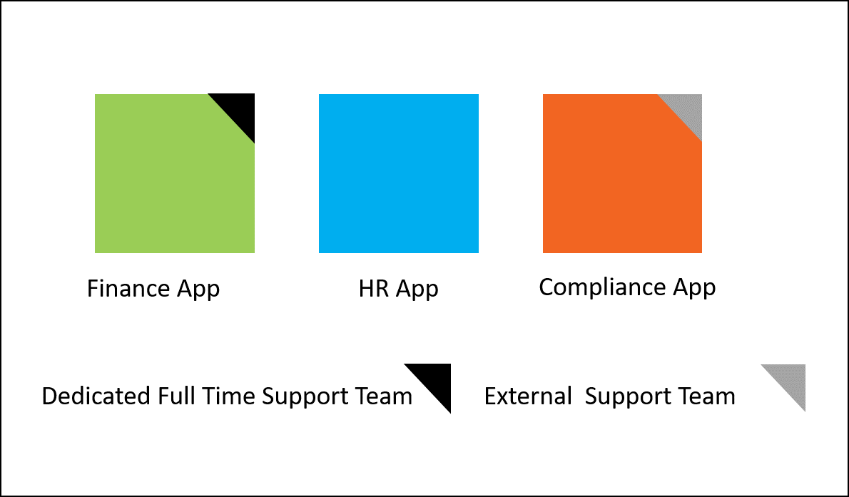
3, Use colors and symbols to add classification value. As an enterprise, you may decide to set standards on app background colors or symbols. For instance, all blue background icons might be related to HR, whereas all green background icons are related to Finance. Notice the app standards below.

In the above example the organization has distributed a standard where the app maker can add any main symbol or image to the app icon. However, they must maintain consistently in the background colors and support tags, and also provide templates to app makers to make this easy to do.
4, Keep localization in mind. If you are a member of an international organization, remember that certain symbols/colors/names may convey a different impression in other parts of the world. Ask your localization team to review app icons before you publish, and to give feedback on whether the icon is appropriate for all audiences. Use region-based environments when apps should be isolated by region, which will reduce the number of non-relevant apps shown to users. This also mitigates the risk that users may not be able to find authoritative apps in the gallery.
I hope this expedites PowerApp adoption in your organization. Please do share your own ideas on how to maximize app icons for service adoption below in the comments area.
Happy PowerApping!
Reference Article: https://powerapps.microsoft.com/en-us/tutorials/set-name-tile/
Audrie
Twitter: @ArtsyPowerApper


