Collaborative Development for PowerApps Canvas Apps
If you are part of a larger team and you were wondering how you can enable co-development on your app, this blog post is for you. As you probably already know, PowerApps does not support multiple developers working simultaneously on the same app. However, with the recent release of canvas components, it’s now possible to divide and conquer app development by deconstructing your apps into many components. Components allow you to clearly define the input/output and the desired behavior making your app more modular. Testing as well becomes easier as you can test individual components in isolation with each other. In this blog, I will present some ideas to successfully orchestrate collaborative development across your team using components.
Let’s take a concrete example. Let’s imagine a 3-4 person team that is tasked to build an event management app. The app will have a scrolling list of events/sessions. Users can see the details of session and comment on the session. There is also a news feed that helps users stay engaged with app. You can download this app here https://aka.ms/powerapps/componentappsample

Nat is a back end developer who will be in charge of creating the initial database needed for the project. Nat will work with the team to define the various entities and relationships required to fulfill the various requirements. Later in the project, he can take on building functional components such as the map control.
Cam is in charge of shared components. Navigation controls, Header, Hamburger menus falls under the shared team responsibility. Cam’s role is to not only make this project successful, but also extract generic components that can be re-used across multiple apps. The Search box and pre-loader are good examples of such components. As we will see later, those will be packaged in the Contoso Shared Component app.
App Skeleton
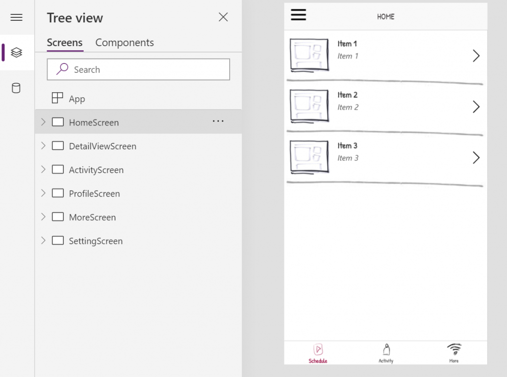
Imani’s priority is to enable others on the team to start contributing. He can ensure that there is a consistent way across the app to load data and pass it to other screens and components. To do so, Imani uses a starter app template with well known established patterns . Taking a closer look at the app, you will see that the OnVisible of HomeScreen looks like this:
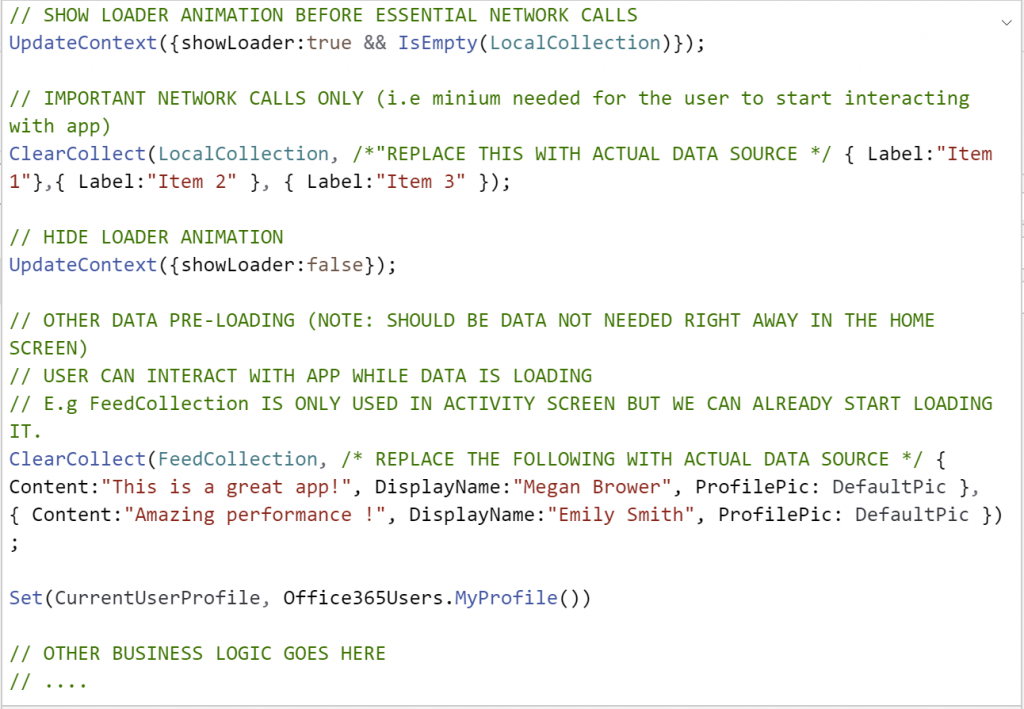
The team should be familiar with the data loading patterns and other patterns that will not only help build a well performing and maintainable app but also makes it easier to collaborate on the same app.
They will be able to use the some collections and global variable defined in this screen.
Passing data to other screens would look like this. (E.g The OnSelect of the gallery control)![]()
Notice the use of context variable in the Navigate function. This ensures decoupling the Homescreen from the DetailViewScreen (DetailViewScreen does not need to know about Gallery.Selected. It’s dealing directly with SelectedItem)
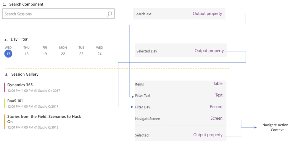
This is essentially all that is needed to enable other users to start contributing to the app. Imani and team can now start breaking down the app into different components. Each component will have a set of input/outputs that the team agrees on. In the case of the conference app here is what the team agreed on for the home screen.
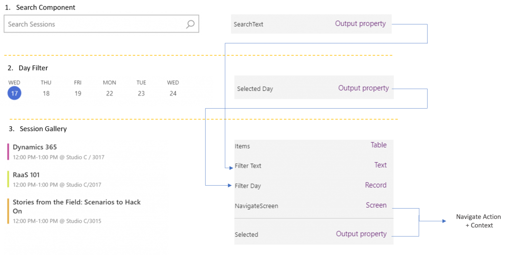
You can see from the image above, The Search component output is fed directly to the Filter Text Input of Session Gallery component. Similarly, the day filter output is fed directly into the Filter Day input of the Session Gallery. The Session Gallery has another input that indicated where to navigate when the gallery is clicked. It also keeps the selected item exposed in the Selected Property.
Forking the App
Both Adi & Nat will find it useful to work with real data as they are building their components. For that, Imani will duplicate the “master” app. They can work off a copy of the app even though any more progress of the master app will not be reflected here. That’s all right though, they will only be using the data loading portion of the app in order to have a more realistic input to their component as they make progress. In fact, we should expect little changes to the master at this point. Additional functionality to the master app should be brought via components. These components should all be created withing their respective component libraries as outlined in the following doc https://docs.microsoft.com/en-us/powerapps/maker/canvas-apps/component-library . Individuals working on the components can test their work by importing (or refreshing) the component library into the forked app. Cam, who is more concerned with generic / app agnostic components can work off the Shared Components Library.
This is what the environment should look like:

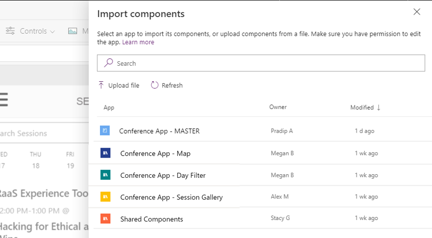
Once the components are ready, Imani can import them into the master app. It’s worth noting that Imani used the Contoso Shared Components app in the initial setup of the master app. This is an app that the shared component team (Cam) made available to the entire organization. Shared components can be themed to adhere to the branding and color guidelines of the organization. You can get started with your own shared components library by downloading components from the github repository here.
The header, hamburger, lower navigation menu and the pre-loader are all located in this app.
The timeline for the project could look like the following:

As you can see here, the blue line represents the master app main “branch”. Components would be integrated into the app by Imani or other designated “integrators”. Generic components would simply be imported. Other custom components such as the DayFilter and Gallery would be integrated into the master app as they become ready. The arrow coming out of the the blue line represents the action of copying the master app. Every now and then, a component might need to be updated, in that case, another copy of the app can be done (as in Component B Update in the diagram above). In this case, the copy will also contain any other component previously integrated. One has to ensure that those components are removed from the copy app before re-integrating into the master app (note: this last step will not be required once the studio offers a richer component library – work in progress).
At the end of the process, we should have a production app entirely composed of components as you can see in the image below.
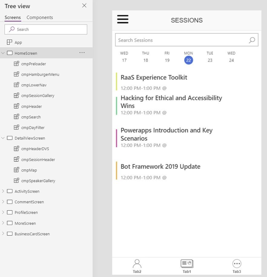
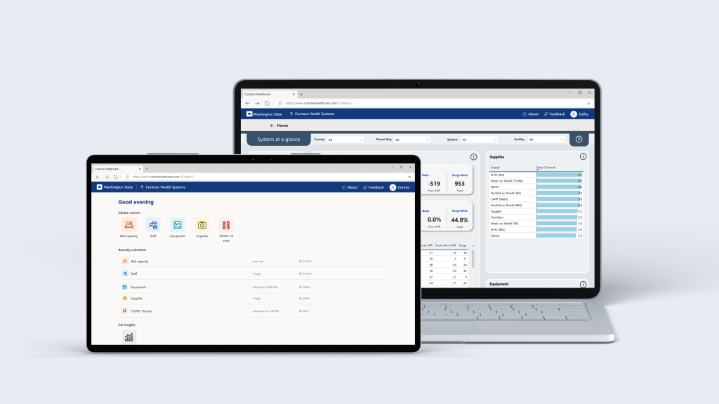
More recently, Microsoft Engineers built a set of Emergency response apps and Hospital emergency response solutions. They used components to as a fundamental mean to rapidly and consistently develop those applications:
In conclusion, I think that distributing app development work via components is a viable approach to collaborative development. It makes apps modular, easily extensible, testable, and encourages re-use across apps. Give it a try. Let us know what you think.
Download the starter template and the sample component based conference app

