Power Apps 2021 Wave 1 Preview Release is now available
The Power Apps Release Wave 1 for 2021 is available for you to enable in your environment ahead of the April rollout. We have a number of new features that will modernize your end users model-driven app experiences.
Get started by opting your environment into the 2021 release wave 1, learn how ( https://docs.microsoft.com/power-platform/admin/opt-in-early-access-updates ).
You can see the full list of the Power Apps early access features (https://docs.microsoft.com/power-platform-release-plan/2021wave1/features-ready-early-access) and Dynamics 365 apps early access features (https://docs.microsoft.com/dynamics365-release-plan/2021wave1/features-ready-early-access).
Let’s dive into a few enhancements that will increase productivity for your end users.
Modern Search
We announced the new search experience in November 2020 and have had many organizations enable it over the past three months. We also announced the addition to intelligence search as part of the new modern search experiences a few weeks ago!
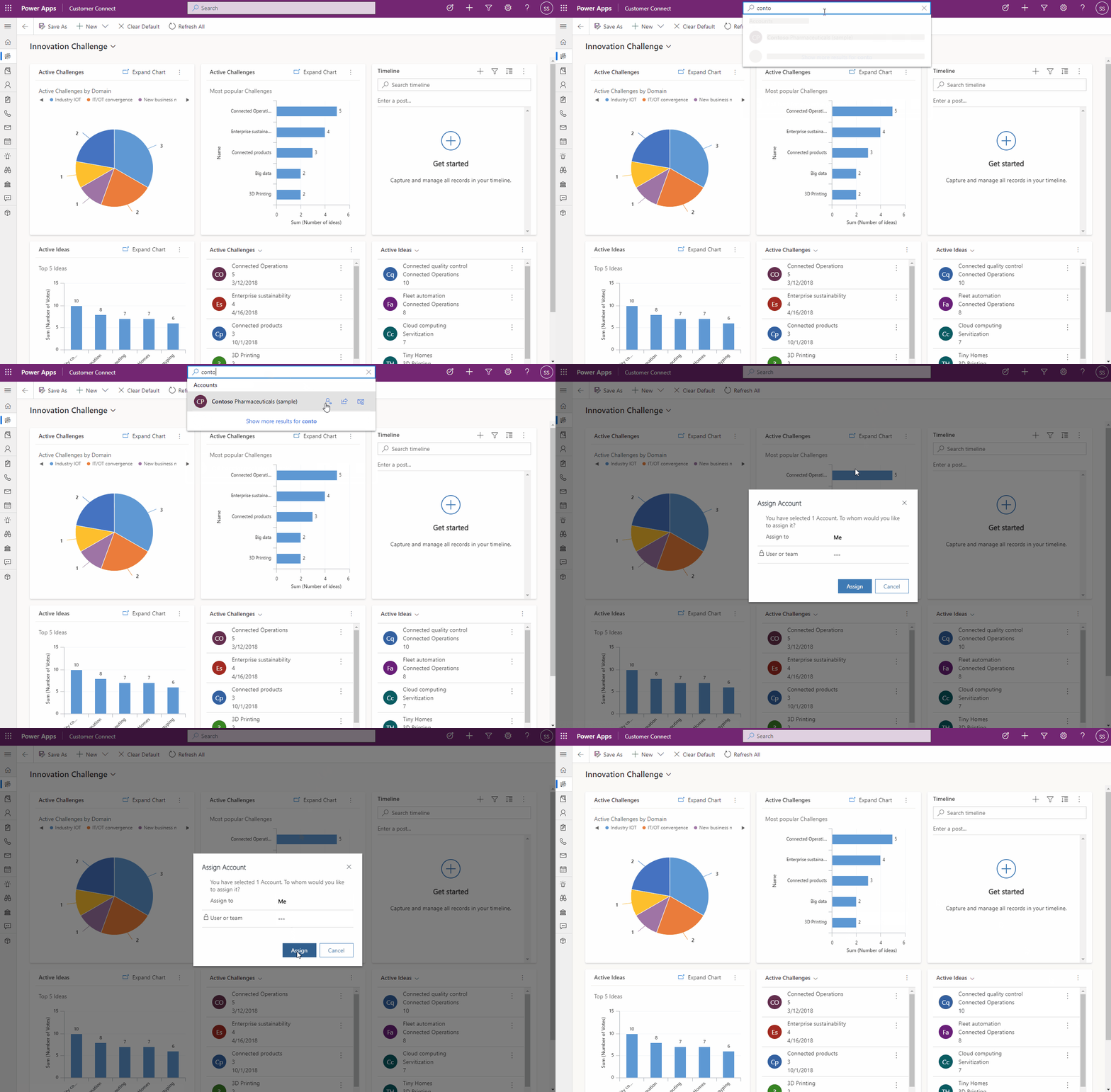
With the 2021 Wave 1 Release we added even more features to make search amazing. The new Relevance Search experience brings some of the most used actions closer to you to help complete your task without requiring navigating to the record page in model-driven Power Apps.
Introducing quick actions – a small set of commands specific to a table – that you will see when interacting with search in a few places in model-driven Power Apps in browser. Some of the commonly used tables are configured to show a set of commands to help you complete your task without losing context.

Mobile Enhancements
A number of mobile productivity enhancements are now available in Dynamics mobile apps.
Mobile Optimized list views
Sort buttons are now on the top of the list making it easy to discover and use for end users in a view. You can also swipe to the left on a row to see available commands and quickly take action.


Sub grid and form tabs
We’ve made improvements to the usability of how data is presented on a form for model-driven apps on Dynamics 365 mobile app running on iOS and Android.
- Sub grids have a prominent header that separates them from the rest of the sections on the form.
- Form tabs are more discoverable because you can scroll and span horizontally across the screen. When you select a tab, it adjusts the header just enough to reveal the next few tabs.
- Empty sub grids display the option to add a new record inline reducing the number of taps needed to add a record.
- The jump bar (ABC) has been removed from grids, and you can now have the option to Search this View at the top of the grid instead of a command.
- Commands on the sub grid are also updated to show up in a drawer from the bottom of the screen, consistent with the page-level commands.


Business Process Flows in Mobile
You will now be able to view important information about your business process flow on mobile, including the name and time active. This new design creates a seamless experience across devices and ensures you know which business process flow you are working with if you switch processes.

Modern Experiences for End Users
End users now get modern duplicate detection and merging records UI out of the box without makers needing to enable these. Multi-line text control is now easier to use on forms with less clicks.
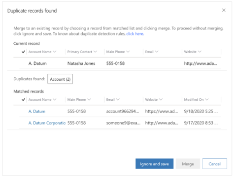
Duplicate detection
The updated experience is designed as a Unified Interface dialog and is integrated seamlessly with merging records to help you manage your data integrity when duplicate records are found. With this new duplicate detection experience you can quickly find and manage records with easier access to merge the duplicates and keep the record you want.

Merging Records
Duplicate records can happen in your data when users create or edit records manually or import data in bulk. You can easily merge data and retain the record you want and choose up to two records to merge from the view or list page. Merge the data into a single record with the new Unified Interface merge record dialog experience.

Multi-line text control in Quick View Forms
Users no longer have to click and scroll to view all of the content in a multi-line text field in a Quick View form. The fields will now automatically expand to show the full content when the Quick View form is loaded on a page. You no longer have to take additional steps to view and read information when using a Quick View form on a parent or main form.


