We are excited to share the latest updates to design studio and provide makers the control and flexibility to build custom webpage layouts with no-code.
Flex container is a new out of the box page component that enables makers to create flexible and responsive page layouts. Makers can add various components like text, images, and buttons (to name a few) to a flex container, as well as nest flex containers with different layouts and alignment of items. They can also style flex containers using design properties such as opacity, overlay, rounded corners, padding, and more. With flex containers, makers can effortlessly build modern and responsive page layouts in a few clicks. Learn more

Makers also have more no-code options to design and style text, image, video and button components. In addition to the existing styles, makers can now adjust advanced options like rotation, scale, and offset. These updates provide even greater flexibility to customize the look and feel of a page. Makers can find all available controls in one place by clicking the paintbrush icon in the in-context toolbar Learn More.

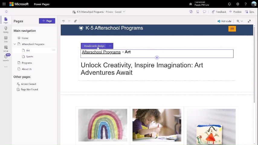
Lastly, breadcrumbs are another new component in design studio. It consists of a trail of navigation links indicating the user’s current location within a website hierarchy. Makers can easily add a breadcrumb component to a page, and style it to match the site styling. Learn more
Explore the endless possibilities of creating beautiful webpage designs with no-code in Pages design studio, and share your feedback!