By Rob Knies, Managing Editor, Microsoft Research
You’re steering with your left hand while your right is punching car-stereo buttons in eager search of that amazing new Lady Gaga song. Your mobile phone rings, and as you adjust your headset—hands-free, naturally—the driver in front of you slams on his brakes …
Sound familiar? For drivers, such a scenario is almost commonplace. These days, the automobile is tricked out with all sorts of conveniences, designed to make driving a comfortable, media-rich experience. But there is a cognitive price to pay in operating these devices while keeping sufficient concentration on the road.
Spotlight: Blog post
Eureka: Evaluating and understanding progress in AI
How can we rigorously evaluate and understand state-of-the-art progress in AI? Eureka is an open-source framework for standardizing evaluations of large foundation models, beyond single-score reporting and rankings. Learn more about the extended findings.
Does it have to be that way, though? Researchers from Microsoft Research Redmond aim to find out.

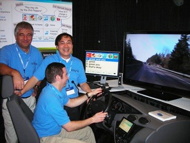
Ivan Tashev (left), Yun-Cheng Ju, and Mike Seltzer (at wheel) demonstrate their Commute UX driving simulator.
Ivan Tashev, Mike Seltzer, and Yun-Cheng Ju, members of the Speech Technology group, are leading a research project called Commute UX, an interactive dialog system for in-car infotainment that makes finding a person to call or a song to play easy and efficient, using natural language input and a multimodal user interface.
“People are in their cars more and more,” Seltzer says, “and they’re trying to do more and more while they’re driving. We’re trying to figure out how we can enable people to do at least some of the things they would like to do in a way that is safer and more natural.
“Those things are correlated. If you could just speak to the system as you would to a passenger, you wouldn’t need to remember hundreds of commands and all the rules of how to use the system. You could keep your brainpower focused on the driving, keep your eyes on the road and your hands on the wheel, and, hopefully, you’d be safer on the road.”
Alex Acero, research-area manager of the Speech Technology group, has a unique vantage point to assess the value of the Commute UX project.
“I’ve been working on speech recognition for 25 years,” he says, “and have seen researchers get excited about speech in one application, only to see that the technology doesn’t take off because users find other alternatives to accomplish their task. But for the car, we have not found an obvious safe alternative to speech, so I’m very excited about the role of speech technology in automobiles―and Commute UX, in particular.”
The hardware involved in the Commute UX project is simple and would not be unfamiliar to drivers of late-model cars already on the road: microphones, a touch screen, a cluster of buttons on the steering wheel. Simplicity is the key to minimizing driver distraction, the Commute UX researchers say, and that maxim is reflected in the project’s guiding principles, which are focused on improving user satisfaction with such in-car systems:
- Speech-enabled: With driving being an eyes-busy/hands-busy activity, speech is the primary channel for interaction.
- Multimodal interface: Speech input works best for browsing large lists, such as a music collection or a mobile-phone address book, while a touch screen or buttons are preferable for selecting from a short list. Transitioning from speech to touch must be a smooth experience, based on driving conditions and user preference.
“What we try to do is to integrate speech into a unified interface,” Tashev explains. “Speech is very strong when you search within a list of 10,000 songs or 300 contacts in your address book, but not so efficient when you have three or four selections or options. Just glancing at the screen and touching to select or using buttons is more efficient. These two actions are very powerful in combination, and we are looking toward the least distracting user interface.”
- Situational awareness: When driving becomes precarious, such as passing or braking, auto passengers typically remain silent in deference to the driver. The Commute UX team hopes to mimic this passenger behavior, and factors such as speed, weather, or driving conditions can prompt the technology to switch off the user interface during challenging moments, eliminating the potential for distraction.
“We want our computer to behave the same way as the passenger,” Tashev confirms, “not to talk to us when we pass, when we change lanes. Usually, if you are braking hard, trying to keep an appropriate distance behind the car in front of you and frantically watching the car behind you in the rear-view mirror, passengers will not talk. In the near future, we expect our system to do the same.”
- Awareness of context and person: Cars usually have a small set of users, and Commute UX should be able to store defaults depending on the driving context and the driver’s habits. Such defaults are easy to define, monitor, and store because of the small number of drivers involved.
- Seamless integration of services based in the car and in the cloud: While standard controls are located in the auto itself, connection to Web-based services enables Commute UX to learn and to provide additional information and functionality.
“In most tasks,” Tashev says, “the onboard system should do the speech recognition and processing, but in many cases, we have an integrated system that can go to the cloud and ask for data such as traffic, weather, and gas prices. The speech recognition happens there. The driver doesn’t care. We want to have a single face for the system: You ask for something, you get it.”
Infotainment systems for automobiles already are being offered by automakers such as Ford and Fiat. What Commute UX adds to the mix is simplicity.
“We really tried to simplify the experience for the user,” Seltzer says. “One of the biggest problems of the current systems is they’re built on a model that says the user will always know exactly what to ask the system and will always ask it in the correct way. We’ve found, by doing some empirical user studies and surveys, that this is not true at all.
“People often don’t remember what to say. Even if they think they know, they’re not saying the correct thing. A classic example we’ve found is tracks on a music player. Often, what you think the song name is might be a fragment of the full name. This occurs in pop music all the time.”
As Ju explains, the project addresses the issue of users being unaware that they’re making input errors.
“One important aspect is called perceived accuracy,” he says. “We know that users don’t read manuals. We know that speech recognition is not perfect. But a lot of mistakes are caused by users. Developers usually don’t consider user mistakes when they design and evaluate most systems. That creates a potential gap between the claimed accuracy and the accuracy perceived by users, because they don’t know they are making mistakes and blame the computer.”
“We try to achieve a good balance so that we don’t penalize the good user, but we can accommodate those users who occasionally make mistakes.”

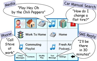
The Commute UX user interface.
Commute UX solves this problem by severely constraining the number of voice commands necessary to obtain results.
“What we’ve done,” Seltzer, “is taken an approach by which the user just needs to say things, very intuitively: ‘Play,” if they want to listen to music, or ‘Call’ or ‘Reply.’ There’s one trigger word into what you want to do, and everything else is very natural.
“I can just say, ’Play the Chili Peppers.’ I don’t have to say, ‘Play artist Red Hot Chili Peppers. I don’t have to remember that it’s an artist. I don’t have to remember that the full name is Red Hot Chili Peppers. It’s a problem to remember 500 commands. It’s probably not a problem to remember three: play, call, reply.”
Cars, of course, offer a noise-laden auditory environment. Commute UX addresses this reality, as well, using state-of-the-art speech enhancement by capturing sound with an array of microphones.
“The car is a very noisy place,” Tashev says. “Microphones and speech-enhancement techniques need to precede the speech recognizer, and the robustness of the speech recognizer needs to adapt to that surrounding noise. The requirements are way harder than a quiet office environment where you use a speech recognizer for dictation.”
The issue was challenging, but for speech researchers, that provides an opportunity.
“We tackled this problem in stages,” Tashev says. “The first is the capturing part: Where are the microphones, and how many are there? We started to do studies on the best position for the microphone: on the dashboard, in the rear-view mirror, right in from of the driver’s eyes? We designed a set of recommendations, which we shared with our partners, Microsoft’s Automotive Business Unit.
The second stage, then, was speech enhancement.
“We want to make it both human- and speech-recognition-friendly,” Tashev adds. “When we say that the human, not the speech recognizer, is the major source of mistakes, this is because of the proper design of the sound-capturing and speech-enhancement system.”
Another unique attribute of the Commute UX system is its ability to provide personalization.
“It’s very easy to upload the personal profile of the current driver,” Tashev says, “to know which telephone to pair. It includes a profile for the speech recognizer, adapted to the way you speak. In your set of messages, you’ll apply your own specific style, your own points of interest for the navigation system, the most frequently played songs and playlists. This whole system uses extremely powerful priority information, which enables us to improve the way the speech recognizer and the information-retrieval system work.
Easy, Comfortable
“It increases usability and user comfort. Each time you open the car, it’s all yours. When your wife opens the car, it’s hers. We believe that personalization will play an important role in future systems.”
The Commute UX project got started during a group offsite in 2006, which prompted the team to schedule brainstorming sessions to determine which directions to pursue next. A direct result was for an automated telephone information system for drivers, including traffic, weather, gas prices, gas-station locations, and stock prices. The system was designed to operate atop Microsoft Speech Server.
“We deployed it in January 2007,” Tashev says, “and gained some experience. Our specific part of this story is location. The car is a moving object, so we deal with streets, points of interest—all this geographical information.”
The use of global positioning systems had not yet become prevalent, and the need to have the telephone system deliver pertinent location information got the researchers thinking about an onboard system. They learned the importance of location and time understanding—and the importance of delivering that information effectively. Call-data analysis and user studies improved the task-completion rate, and they became convinced that using prior information, such as user-provided names for locations visited most often, reduced the number of dialog terms, making it easier for users to do what they wanted to do.
The timing was fortuitous. In November 2007, Ford launched availability of its Sync system, built on top of the Microsoft Auto platform. Sync offered voice-enabled selection of songs and phone-call recipients. Suddenly, on-board infotainment systems were maturing from cool gadgets to integral automotive components.
In the second phase of the Commute UX project, researchers built a prototype, featuring speech commands and queries, and avoiding a complex menu structure.
“Unlike many systems, there’s no menu structure involved,” Seltzer says. “Let’s say you say, ‘Play track Yellow Submarine.’ The system takes you implicitly into the music menu, and it assumes that everything you’re going to say is about music. If you want to make a phone call, typically, you have to back out to the main menu and then make a phone call. In our case, we have what we call ‘say anything at any time.’ I can play a track, and the next command, I can make a phone call. As soon as the phone call is done, I can go back to playing more music.”
As Ju notes, Commute UX also can reply by voice to SMS messages.
Text Messaging, Too
“We know that drivers have the urge to write text messages even when they are trying to drive,” he says. “But we obviously don’t want them to do that. We want to use speech to help them do that.
“Previously, we were thinking we could have a dictation-based system: You say something, we show you the results, you look at which words are recognized wrong and say them again or correct the list. It’s a very straightforward approach. But we realized it was very demanding, too dangerous to even think about. Fortunately, we found a voice-search approach to provide the same service, but with much less cognitive and physical distraction.”
Others at Microsoft Research Redmond have played invaluable roles in creating the technology. Shamsi Iqbal is doing user studies to test levels of distraction and determine opportune times to interrupt drivers with messages and phone calls. Piali Choudhury performed significant development work. Ye-Yi Wang has helped devise techniques for flexible speech recognition. And Acero served as devil’s advocate to keep the project focused.
Tashev, Seltzer, and Ju have more to do. They are still trying to refine the speech-based interface, to make the system easier and less distracting. They are investigating the capabilities a GPS could deliver. In-car cameras might be able to detect and assist a sleepy driver. Many of the technological solutions the team is pursuing could be broadly applicable in the larger context of mobile devices.
Like most of us, the researchers also drive, so the work they’re doing has a chance to improve their lives both personally and professionally.
“We’ve gotten a lot of good support for doing this kind of work,” Seltzer says. “That’s been really exciting. There’s a good chance that this is not only interesting work, but it’s going to be out there on the road, and it will, personally, make my life better.”
Ju identifies an additional benefit.
“I’ve been working on speech recognition for 15 years,” he smiles, “and my wife told me that this is the most exciting project and that, when the product becomes available, she wants to buy it right away.”
Tashev elaborates.
“We were able to put a lot of pieces of technology together, and, wow, it works! It works quite well. That was the most exciting part for me, building the end-to-end system, a system that integrates a lot of interesting technologies but is interesting in itself.”


