

When a product adopts an experimentation-driven culture, software development tends to shift from being a top-down decision to more of a democratized approach. Instead of arguing about what should be built, product leaders define goals for metrics to improve the product, and they empower their teams to invest in changes that will ultimately achieve those goals. This allows the organization’s culture to innovate faster by testing multiple ideas for improvement, fail fast, and iterate.
One of the best ways to experiment with a software product is to run A/B tests. For successful A/B tests, it is very important to have the right metrics. But what makes a good metric? Is the company’s stock price a good metric for a product team? Probably not. It is not sensitive to small changes in the product, and we cannot observe the counterfactual – that is, the stock price in the universe where the treatment is not present. Perhaps the company could conduct an extensive user survey for each change, and then measure the degree of satisfaction that their users have for the change. However, such a survey for each product change would annoy users, it would be very costly to scale, and it would not be reflective of the overall user population because many users won’t respond to the survey. These examples demonstrate just how challenging it is to define a good A/B metric.
So how do we define a good metric? After running hundreds of thousands of A/B tests at Microsoft, we have identified six key properties of a good A/B metric:
- Sensitivity
- Trustworthiness
- Efficiency
- Debuggability
- Interpretability and Actionability
- Inclusivity and Fairness
In this blog post, we will examine each of these properties more closely to understand what makes a good metric, and we will provide checks to test a metric against each property. We would like to emphasize, however, that these are general properties of a good experimentation metric. They are necessary properties for most experiment metrics, but they may not be sufficient for use in every single case. In later blog posts, for instance, we will discuss Overall Evaluation Criteria (OEC) metrics that should have additional properties, such as being a proxy for the overall product, user, and business health.
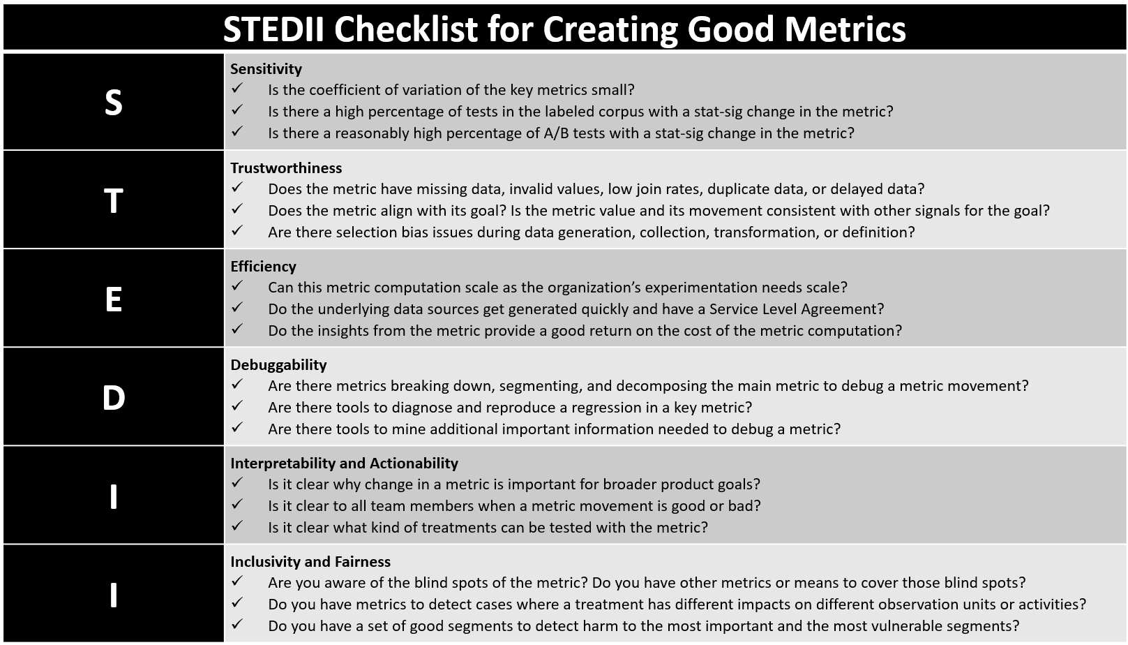
STEDII Checklist for Creating Good Metrics
Sensitivity
In a previous blog post, we discussed the details of measuring and checking the sensitivity of the metric. We will briefly summarize those details here. A sensitive metric has a high chance of detecting an effect when there is one. Conversely, when a sensitive metric that is well powered has no stat-sig movement, we have high confidence that there is no treatment effect. Let \( H_1\) be the alternative hypothesis – i.e., there is real treatment effect of a certain size. Then,
\(Prob\)[Detecting the treatment effect on the metric] = \(Prob(H_1)Prob(\text{p-value}<0.05|H_1)\).
To measure the sensitivity of a metric, we can use a labeled corpus, consisting of tests in which there is high confidence that a treatment effect exists. That confidence is built by examining many metric movements to check if they align with the hypothesis of the test, deep dives, and offline analyses that add more evidence to the correctness of the hypotheses of the A/B tests. A sensitive metric will have a high proportion of stat-sig changes when there is an empirically known impact from the corpus. In cases where there is no labeled corpus, a more sensitive metric would have a higher proportion of overall tests where it is stat-sig. This will include no more than 5% false positive stat-sig tests, in the event that all tests in the corpus have no impact on the metric.
There are two components of metric sensitivity [1]:
- Movement Probability \([Prob(H_1)]\): How often is the alternative hypothesis true?
- Statistical Power \([Prob(\text{p-value}<0.05|H_1)]\): Given that an alternative hypothesis is true, how likely is it that we are able to detect the effect?
Movement Probability
If the movement probability of a metric is low, the metric will rarely have a statistically significant movement, even though it may have very high statistical power. In cases of well-optimized products, high-level metrics (such as “days active” and “sessions per user”) can be very difficult to improve in a short period of time, but they can regress very easily. So those metrics are poor indicators of success, but they are good guardrails. Proxy metrics with higher positive metric movement probability are better success metrics that we can aim to improve in an experiment. In other cases, we can improve metric design to measure more sensitive transformations of a metric, such as the “capped average of log of time spent in Teams,” instead of a simple average.
Statistical Power
Statistical power is the probability of detecting a stat-sig change if the alternative hypothesis is true. We refer to the smallest magnitude of metric change detectable with high probability (usually 80%) as the Minimum Detectable Effect (MDE). The smaller the MDE, the higher the statistical power. If we assume that Treatment and Control have the same size and the same population variance, the relative change (expressed as a fraction of the control mean) that we can detect (using the t-test) with 80% power is approximately \(\frac{4 \times CV}{\text{sample size}}\) [4]. Here, \(CV\) is the coefficient of variation, defined as the ratio of the standard deviation (\(\sigma\)) of a metric to its mean (\(\mu\)), \(CV = \frac{\sigma}{\mu}\). When designing a metric, we want to aim for a low \(CV\) in order to get more statistical power.

Checklist for Creating Sensitive Metrics
Trustworthiness
Metrics are not only used to make informed product decisions, but they also help determine the incentives and future investments of feature teams. An untrustworthy metric can send a product down a wrong path and away from its aspired goal. While the accurate estimation of the variance of a metric should be handled by the experimentation platform, the metric authors should focus on data quality, alignment with the goal and user experience, and generalization.
Data Quality
Our previous blog post on data quality provides an in-depth guide on data quality. For completeness we will summarize some of its key points here. When creating a metric, we should check for the following aspects related to data quality: missing data, invalid values, low join rates with other data sources, duplicate data, and delayed data. As mentioned in another past blog post on validating the trustworthiness of a metric, we must check to ensure that the p-value distribution of a metric under multiple simulated AA tests is uniform. Moreover, we recommend regularly monitoring these aspects of key metrics through dashboards, anomaly detection methods, and AA tests in order to detect and resolve any regressions.
Alignment with the Goal and User Experience
When a metric is aligned with a key product goal, it aggregates data from all observation units into a single number that is most pertinent for that goal. For example, a common goal for end-to-end performance of a product such as Page Load Time (PLT) is that it should be satisfactory for the large majority of the page load instances. The distribution of PLT is usually very skewed with a long tail. Average PLT is a poor metric to track the goal, but a metric like the 95th percentile or the 99th percentile of the PLT is more suitable. If that is hard to compute, then another option would be a metric which estimates the proportion of page loads where PLT exceeds a threshold. Further PLT is only useful if it is measuring the latency of users’ experiences when loading a page. For instance, some webpages load most of the content after the standard page load event (opens in new tab). In such cases, a good metric would measure the latency to the point where the page becomes functional for the end user.
Often, the goal will be clear (e.g., “increase user satisfaction”), but it will be hard to determine a metric that actually aligns with that goal. In those cases it is important to test those metrics on a corpus of past A/B tests that we can confidently label as good or bad in terms of the desired goal [2]. In an upcoming blog post, we will discuss how to develop a trustworthy OEC that reflects user satisfaction.
Generalization
A trustworthy metric provides an unbiased estimate for the entire population for which a product decision is being made. The most important factor to look for in this case is selection bias in data generation, collection, transformation, and metric definition and interpretation.
An example of a bias in data generation is “app ratings” in the App Store. If an app only sends users with a positive outlook to the App Store, then the data generated from user reviews will be biased in a positive direction. A data collection bias can occur if we are unable to collect data from users who abandoned the product too quickly, or if the data collection is affected by the feature being tested. Data transformation can introduce a bias if we are incorrectly identifying spurious users (such as bots or test machines) and we are either removing legitimate users or including spurious ones [5]. Metric definition and interpretation can also introduce bias if the metric is analyzing only a subset of the intended-to-treat users or if it puts more weight on certain users or actions unintentionally.
We recommend being very vigilant of selection bias from end-to-end, validating whether a metric value and its movement are consistent with other tracked measurements and our expectations of its movement in an A/B test. For metrics that are particularly important, it may be a good idea to run A/B tests where we are certain about the outcome, and then verify whether or not the metric movement aligns with it.

Checklist for Creating Trustworthy Metrics
Efficiency
As the Experimentation Flywheel turns, more and more A/B tests are run regularly, and we will need to compute A/B metrics for a large number of A/B tests. Therefore, the time, complexity, and cost to compute the metrics should be manageable. We will examine these factors related to efficiency in more detail below.
- Time: Agile software development needs reasonably quick decision making. For an A/B metric to become an integral part of that decision making, we should be able to compute that metric quickly. Metrics like “proportion of monthly active users,” which are common key product indicators, do not offer agility for scalable experimentation; we would have to run an A/B test for multiple months before we could begin to compute it. Better alternatives are metrics that act as proxies and surrogates of change in Key Performance Indicators – such as “days active per user” or “sessions per user,” as proxies for “proportion of monthly active users.”
- Complexity and Failure Rate: Complex metrics, such as those that need to be computed in a lab, won’t scale to properly represent the user base – e.g. Cognitive engagement metrics based on user interviews. We should also avoid complex metrics that may have a high failure rate due to dependence on multiple data sources or large data sets that cannot be parallelized.
- Cost: We need to maintain a satisfactory Return On Investment (ROI) for each metric and the insights that we gather at scale from it. Getting labels (such as “is an email spam” or “is an ad relevant”) from human judges at scale is possible, but it will be expensive. Also, metrics that depend upon costly and complex statistical or machine learning models will have a high cost. It is better to find simpler alternatives for efficiency and interpretability reasons (discussed later in this blog post).

Checklist for Creating Efficient Metrics
Debuggability
Debuggability is essential for experimenters to understand why a metric is moving in an A/B test. If the metric regresses, the metric debugging must help the experimenter narrow down the cause of the regression so that a bug can be fixed or the design of a feature can be changed. Equally important, if the metric is improving, the metric debugging should help the experimenter understand why it improved. This will prevent them from falling prey to confirmation bias, and it will also help guide future investments. Let‘s discuss two common methods for making a metric debuggable: debug metrics and tools.
Debug Metrics
Debug metrics capture additional changes or treatment effects that help us better understand the movement of a more complex metric. They typically zoom in on a specific property of the complex metric in order to shed more light on the treatment impact. The reduced scope of the debug metrics usually makes them more sensitive [4].
There are three common ways to construct debug metrics:
- Breakdown: Breakdowns allow us to separate the different types of events that are contributing to the overall metric. For example, consider a metric like “app crash rate.” We can break it down by key factors like crash codes, and then we can create a family of debug metrics – such as “app crash rate with code A” – for each code we encounter. We must note that in order to ensure that we capture all crashes, the breakdown debug metric values should add up to the main metric – “app crash.” Usually, a treatment will increase errors of a particular type; therefore, such a breakdown can quickly identify the cause of the main metric movement.
- Segment: We can segment a main metric, such as “clicks,” by factors like “browser” in order to create click metrics based on data from a given browser or a given date. Again, this helps narrow down problems that may be specific to a particular factor, such as issues with a browser or outage on a particular day. Such segments are usually defined for a whole set of metrics so that we can obtain the entire set of metrics for a particular segment at a lower cost with batch processing.
- Decompose: We can decompose complex metrics, such as “Click Through Rate (CTR),” into component metrics like “numerator” (clicks) or “denominator” (impression) metrics so that we can determine which component is the major contributor to the metric movement. An increase in a CTR metric may generally be considered good; but if it is caused by a decrease in impressions, it may indicate a regression.
Tools
Key guardrail metrics, such as “performance” and “reliability,” benefit from diagnostic and raw data debugging tools that identify the cause of a regression. The diagnostic tools can help reproduce and diagnose an issue in a developer’s machine that is running the treatment. For instance, by inspecting the data that a device is sending, Fiddler can help pinpoint regressions in performance or telemetry loss. We recommend that teams should develop tools that can mine the A/B test data to find instances of regressions in raw data, such as stack traces for crashes that are caused more often by treatment than by control.

Checklist for Creating Debuggable Metrics
Interpretability and Actionability
In order to enable the best informed product decisions, a good metric must be easy to understand and easy to act upon by all team members – not just experts. Interpretability reinforces the trustworthiness and debuggability of the metric, and it also provides the right information for the proper usage of a metric in a product decision. In general, there are two key aspects of interpretability that we should be mindful of – clarity about the goal and direction of the metric, and caveats about its usage.
Clarity About the Goal and Direction of the Metric
For a metric to be interpretable and actionable, it is essential for all team members to understand what the goal of the metric is, and why it is important. This context is provided by the name and description of the metric, as well as by the presentation of its results in relationship to other metrics. We recommend establishing a review process to ensure that at least one person who is not involved with creating a metric can understand its goal and importance.
It should also be easy for all team members to understand when a metric movement is good or bad. We should try to design the metric in such a way that we can assign a “good-for-the-user” or “bad-for-the-user” label to its movement in a specific A/B test. At ExP, we use color coding to indicate the difference between a good or a bad movement. This is usually the first level of information that A/B test owners consume in order to make a decision about the test.
If a movement in a metric can be interpreted as either good or bad, depending on the treatment tested, then it introduces an extra level of subjectivity in the process. It is best to try to avoid that subjectivity through a better metric design. An example would be the tracking of the distribution of page views in a product across users, and understanding how a treatment impacts heavy users (those with a large number of page views) and light users (those with a small number of page views). This metric distribution could potentially be represented in a histogram that tracks the proportion of users falling in buckets labeled as 1, [2,4), [4,8), and so on. However, this would be challenging to properly interpret. A loss of users in the [2,4) bucket could be good if those users moved to the [4,8) bucket, but it would be bad if they moved to the 1 bucket. It would be better to represent the cumulative distribution with buckets labeled as 1, [2,∞), [4,∞), [8,∞), and so on. In this representation, loss in each bucket would have an unambiguous interpretation; a decrease in bucket 1 would always be good, while a decrease in any other bucket would always be bad. This property is also referred to as directionality.
Caveats About the Usage of a Metric
Almost every metric has a blind spot, because it is aggregating a large number of measurements from all observation units into a single number. It is important to communicate the limitations of the metric, and most importantly, the cases when a metric should not be used. Not all metrics will be able to test every kind of change. It is essential to know exactly what kind of changes will be tested in an A/B test, so that the metric can be properly designed to measure their effect. A good example would be a revenue estimate metric that is computed using the historical averages of revenue made per action type. This metric works well for testing changes where the revenue made per action type has not changed; but otherwise, it will give a wrong estimate. In websites, the time to load a page is usually measured as the time difference between the first request sent by the client to load the page and the actual page load event. This estimates the amount of time that a user must wait before they see the page content. But if a treatment is still loading content after the page load event, or if a treatment is issuing the request to load a page in advance, then this metric breaks and is no longer valid.

Checklist for Creating Interpretable and Actionable Metrics
Inclusivity and Fairness
Although there may be a small set of OEC metrics that indicate the success of an experiment, experimenters should rely on a holistic set of metrics to make sure that a product decision is inclusive and fair [5]. Each metric in a metric set provides one data point that is used in conjunction with other data points in order to make a product decision. For inclusive and fair decision making, it is important to make sure that there is no unintended bias in our metrics. This is ensured by looking at three major factors: missing values, weights, and heterogeneity.
Missing Values
We have already discussed selection bias issues in the Trustworthiness section, under the subheading labeled “Generalization.” Selection bias does not exclude observation units randomly between treatment and control. Rather, it leads to the exclusion of observation units that share a common set of characteristics. For example, devices with low network bandwidth may not be able to load a page fast enough to send data before a user gets frustrated and abandons the product, or users who are neither very happy nor very unhappy with a product tend to respond less to surveys about user satisfaction. Metrics that overlook missing value issues in certain segments of observation units are blind to the regression in product experience for that segment.
Whenever possible, we should try to design metrics in a way that either avoids missing values or else can impute missing values. For instance, a “clicks per user” metric can impute 0 values for users who were assigned to treatment or control, but who did not show up in the product logs. But in metrics relating to performance and ratio metrics we cannot impute 0s for missing values. We ought to have data-quality metrics that alert us in case the proportion of missing values changes due to the treatment. For survey-based metrics with large numbers of missing values that cannot be imputed easily, we should have alternative proxy metrics that are based on data that can be observed from most observation units.
Weights
A metric can typically aggregate data from observation units in three different ways:
- Giving equal weight to all units (e.g., proportion of users who have at least one click)
- Giving equal weight to every activity of a unit (e.g., proportion of sessions with a click, or proportion of impressions with a click)
- Simply counting the average number of events (e.g., clicks per unit)
Even if one of these metrics may be the main metric that aligns with the goal of the A/B test, it is best to have multiple metrics that place different weights on observation units and activities, so that experimenters can get more insights on the distribution of a metric movement along key factors. This will ensure that we are more confident in making a good product decision. For a product with a mix of heavy and light users, a “clicks per user” metric generally increases with increase in overall engagement with the product; but it could also increase due to an increase in engagement from heavy users, even when there is a drop in engagement from light users. Similarly, a “clicks per impression” metric generally increases when there is an overall increase in engagement with impressions; but it might also increase when there is more engagement with a popular page of the product, even when there is a decline in engagement with less popular pages. Lastly a “proportion of users with a click” metric increases when non-engaged users become more engaged; but when already-engaged users are more engaged with the product, it may not show an increase [1, 4].
In cases where we want to ensure an improvement in performance for the bottom 5% or 10% of the observation units, we should compute 95th and 90th percentile metrics or threshold metrics (as we discussed in the Trustworthiness section, under the subheading labeled “Alignment With the Goal and User Experience”).
Heterogeneity
A/B metrics estimate the average treatment effect over all observation units, and they can sometimes be blind to different impact of a treatment on a specific segment of users. Therefore, it is important to have good segments that allow for the viewing of a metric for a subpopulation. A good segment should have the following properties:
- Interpretable: Any team member should be able to understand the segment information.
- Low cardinality: A segment should ideally have a small number of groups (ideally less than 20); this will save time on computation, and it will make it easier to go over segment-level information (e.g., divide all the countries of the world into regions, rather than having 180+ countries).
- Well-powered: A good segment definition should lead to good and even statistical power across all segment values, in order to be able to detect heterogenous treatment effect.
- Correlation with attributes likely to impact experience: Segment definitions should be guided by the product and user understanding to help identify the impact on most vulnerable section of users. E.g., new users, users with low end devices, or users identified by external modeling to be “at risk of churning”.
Common segments include market, country, pre-A/B test activity level, device and platform, day of the week, and product-specific user personas. For more details, read our earlier blog post on Patterns of Trustworthy Experimentation: During Experiment Stage.
Some metrics where a more uniform distribution of a metric across units is a favorable outcome, we can also create metrics (opens in new tab) that track that goal directly.

Checklist for Creating Inclusive and Fair Metrics
Summary
In this blog post, we introduced the STEDII (Sensitivity, Trustworthiness, Efficiency, Debuggability, Interpretability, and Inclusivity) framework to define and evaluate the good properties of a metric and of an A/B test analysis in general. Each of these properties are essential; and together, they reinforce each other to ensure a good set of metrics for a proper analysis of an A/B test, which will yield valuable insights and enable good product decisions. Many metric authors at Microsoft have successfully used this framework, and we hope that all our readers find it equally valuable!
– Somit Gupta and Widad Machmouchi, Microsoft Experimentation Platform
References
[1] Deng, A. and Shi, X. 2016. Data-Driven Metric Development for Online Controlled Experiments. Proceedings of the 22nd ACM SIGKDD International Conference on Knowledge Discovery and Data Mining – KDD ’16 (2016), 77–86.
[2] Dmitriev, P. and Wu, X. 2016. Measuring Metrics. Proceedings of the 25th ACM International on Conference on Information and Knowledge Management – CIKM ’16 (2016), 429–437.
[3] Kohavi, R. et al. 2009. Controlled experiments on the web: survey and practical guide. Data Min Knowl Disc. 18, (2009), 140–181. DOI:https://doi.org/10.1007/s10618-008-0114-1.
[4] Machmouchi, W. and Buscher, G. 2016. Principles for the Design of Online A/B Metrics. Proceedings of the 39th International ACM SIGIR conference on Research and Development in Information Retrieval – SIGIR ’16 (New York, New York, USA, 2016), 589–590.
[5] Dmitriev, P. et al. 2017. A Dirty Dozen: Twelve Common Metric Interpretation Pitfalls in Online Controlled Experiments. Proceedings of the 23rd ACM SIGKDD international conference on Knowledge discovery and data mining – KDD ’17 (Halifax, Nova Scotia, Canada, 2017).