

The Microsoft Academic Graph (opens in new tab) makes it possible to gain analytic insights about any of the entities within it: publications, authors (opens in new tab), institutions (opens in new tab), topics (opens in new tab), journals (opens in new tab), and conferences (opens in new tab). In this series, we present analytic insights about current conferences, which we hope will help you prepare for attending each event. All of the insights within are derived from the Microsoft Academic Graph and visualized in Microsoft Power BI. You can generate your own insights by accessing the Microsoft Academic Graph through the Academic Knowledge API (opens in new tab) or through Azure Storage (opens in new tab) (please contact us (opens in new tab) for the latter option). If you would like to learn how we generated the insights below, please see the repository with source code (opens in new tab).
In this post, we present historical trend analysis about the conference WSDM-ACM International Conference on Web Search and Data Mining (opens in new tab), taking place in Melbourne, Australia from February 11- 15, 2019. We derive insights from 2008 to the latest available year.
Click on each image for current trends and data hosted by Microsoft Academic Graph (opens in new tab).
WSDM paper output
The chart below shows the evolution of the number of conference papers for each conference year.

In the following chart, the black bars represent the average number of papers a conference paper references for each conference year. The data shows that recent publications tend to reference more papers. The green bars show the average number of citations received by a conference paper for each conference year. Note that the citations are raw counts and not normalized by the age of publications. This is because the “correct” way to normalize the citation counts turns out to be a nontrivial problem and may well be application-dependent. Please treat the raw data presented as an invitation to conduct research on this topic!

*Average Citations: Average number of citations a WSDM paper received for a given conference year.
*Average References: Average number of references a WSDM paper references for a given conference year.
Memory of references
How old are papers cited by WSDM papers? Follow a given year’s column to see the age of papers cited in conference papers published that year. For example, in 2016, WSDM papers collectively cited 124 papers published in 2015, 241 papers published in 2014, and so on.

*If some years appear to cite publications from the future, it is likely due to two scenarios. First, they cited papers that are published in journals later. Second, they cited books. When a new edition of the book appeared, it replaced the previous one in the Microsoft Academic Graph, and the citation appears to be from the future. In this representation, we remove all instances of papers citing papers more than one year in the future to generate a cleaner view.
Outgoing references
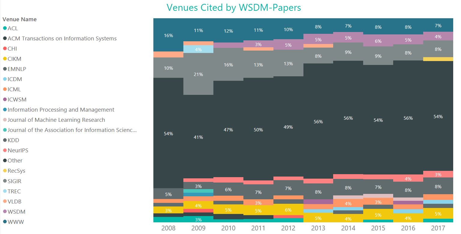
What venues do WSDM papers cite? Are they usually from the same venue?
The charts below show the outgoing reference distribution by venue. The bar chart below shows the top ten venues cited by WSDM papers. SIGIR, WWW, and KDD emerge as the top three. The pie chart below shows that the top ten most frequently cited venues make up 45 percent of the total outgoing references from WSDM papers.

The 100 percent stacked bar chart below shows the percent of references given by WSDM papers to each of the top ten venues, year by year.
Incoming citations
What papers cite WSDM papers? Are they usually from the same venue?
The charts below show incoming citation distribution by venue. The pie chart below shows that the top ten venues that cite WSDM papers the most makes up 27 percent of the total incoming citations. The bar chart below shows the top ten venues that cite WSDM papers the most. This time, CIKM is at the top, followed by SIGIR and WWW.

The 100 percent stacked bar chart below shows the citation distribution from the top ten citing venues, year by year.

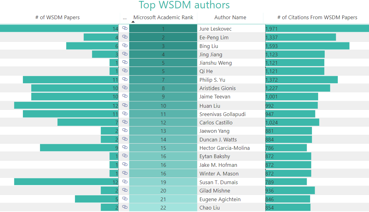
Most-cited scholars
Who are the most-cited scholars of all time by WSDM papers?
The chart below ranks the most-cited authors by using number of publications cited by the conference and number of citations received from the conference. Authors do not have to have published in WSDM to appear on this chart.

Who are the rising stars among the top cited scholars in WSDM? The 100 percent stacked bar chart below shows the citation distribution by the top 20 authors, year by year.

Top institutions
Which are the top institutions based on accepted papers by WSDM?
The bubble chart visualizes the top institutions at WSDM by citation count from their accepted WSDM papers. The color saturation of the bubble is proportional to the total number of publications from that institution that were accepted by WSDM.
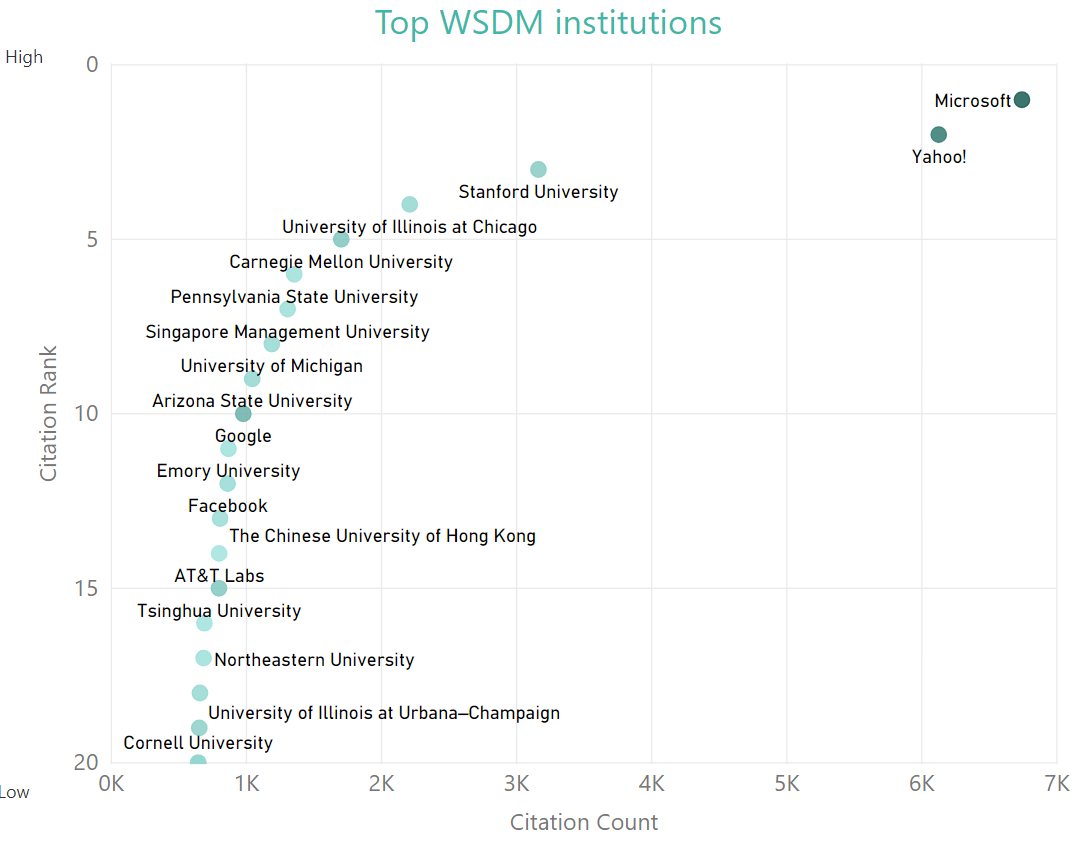
Get the most current data and also explore the top institutions at the conference in more detail by clicking the chart. Once on the underlying Microsoft Power BI report, click on a column to rank the top institutions by publication or citation count.

Top authors
Who are the top authors based on their WSDM papers?
The next three charts show author rankings according to different criteria.
The bubble chart displays WSDM authors ranked by citation count, with bubble color saturation being relative to publication count.

Get the most current data and also explore the top authors at the conference in more detail by clicking the chart. Once on the underlying Microsoft Power BI report, you can also explore the top conference authors in more detail. Click on a column to rank the top authors by Microsoft Academic rank, publication, or citation count.
The bubble chart below visualizes author rank, which is calculated by Microsoft Academic by using a formula that is less susceptible to citation counts than similar measures. The X axis shows author rank. The higher an author’s rank, the closer they are to the right side. The Y axis normalizes the rank by publication count and enables us to identify impactful authors who might not have had a very large number of publications. The closer an author is to the top, the higher their normalized rank. Of course, the area of the chart that represents the highest rank is the top right corner.

We hope you have enjoyed the analytic insights into this conference made possible by the Microsoft Academic Graph (opens in new tab)! Please visit our Microsoft Academic Graph page to learn how you can use our knowledge graph to generate your own custom analytics about an institution, a topic, an author, a publication venue, or any combination of these.
As always, we would like to hear from you either through the feedback link at the bottom right of the website (opens in new tab), or on Twitter (opens in new tab). You can also find our project home page with this blog on the Microsoft Research site at aka.ms/msracad (opens in new tab).