| Sean Boon from the Reporting Services team here. In the spirit of last week’s SQL Server Sequence question about Reporting Services 2008 R2. I wanted to talk more about the new visualizations and how they can help you effectively communicate insights in your data. |
 |
 |
Maps. Maps can be very powerful visualizations. They can consume and visualize SQL Server geospatial and geometry data directly (as shown by Ed Katibah here, and myself here) “regular” data, and combine multiple datasets using map layers. Maps can integrate ESRI shape files, as well as directly integrate with Bing Maps. |
 |
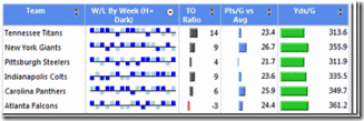
Sparklines. Sparklines are defined as “data intense, word-sized graphics” and are commonly used in tables to show trends. You can find a walkthrough of how to add sparklines to your reports here. |
 |
|
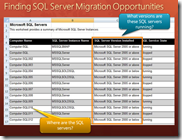
Data Bars. Data bars, much like sparklines, are small charts typically found in the cells of a matrix or table. Instead of containing many values though, they usually contain one or just a few values. You can see an example in a portion of a report, provided below, that shows both sparklines and data bars in action.
|
|
 |
|
Indicators. Indicators are small icons you can use to denote status or trends in your reports. While Report Builder 3.0 contains several pre-configured indicators, you can mix and match icons from different indicator sets to create your own unique sets. You can even provide your own images to be used as indicators! Indicators can also be embedded inside gauge report items.
![clip_image002[4] clip_image002[4]](https://www.microsoft.com/en-us/sql-server/blog/wp-content/uploads/2018/03/clip_image0025B45D_45d4b626-2626-43af-a7f7-c9f14a8b2f63.gif)
|
|
Our team is really excited to bring you these new visualizations in the Reporting Services 2008 R2 release! We especially had a lot of fun testing these features. At one point, one of our team members even hooked up a GPS recording device as he drove around town just so he could upload the data into SQL Server as spatial data types and display his route on the map. As an unintended consequence (ok, maybe it was intentional), he was also able to calculate his speed along the route and display it using the color rule feature on the map. We’re not going to comment on what that map reveals =).
Let us know how you like the new data visualization features in 2008 R2. Send us your examples or your comments to the SSRS team or myself at www.twitter.com/SSRS and www.twitter.com/seanboon respectively. We also have a team blog with even more Reporting Services information.


![clip_image002[4] clip_image002[4]](https://www.microsoft.com/en-us/sql-server/blog/wp-content/uploads/2018/03/clip_image0025B45D_45d4b626-2626-43af-a7f7-c9f14a8b2f63.gif)


